FireflySpark
Redesigning Spontaneous Social Connections
Introduction
About This Project
Firefly Spark is a mobile app designed to encourage spontaneous, real-life social connections. The app removes the pressure of hosting or joining meetups by making the process quick, casual, and stress-free — especially for introverts and passive users who avoid traditional social platforms.
The Story
In a world where digital connections are abundant but real-life interactions are declining, Firefly Spark was born from a simple question: “How can we make meeting people in real life as easy as swiping on an app?” Our team set out to design an experience that transforms passive scrollers into active participants in their local community.
Discovery
Problem vs Solution
The Problem
- Most users feel pressure or anxiety about "hosting" an event.
- Existing apps require too many steps to create or join hangouts.
- The process feels like filling out a rigid form, not something casual or fun.
- Passive and introverted users remain isolated as a result.
- If no one easily starts an activity, the community stays inactive.
- Competitors face the same issue: very few organic meetups begin.
The Solution
- The "Spark" flow is quick and casual: suggest an idea in just a few taps.
- Activities can be started anonymously — no pressure to be the host.
- The app pre-fills details and uses smart defaults — no forms to fill out.
- Commitment deposits reduce flaking without adding stress.
- Empathetic UX reduces social anxiety throughout the journey.
- As a result, more users go out, join activities, and make real connections.
Preparation
Design Process
A structured four-phase approach that took the project from initial research through to a polished, user-tested product.
Ideate
Research, brainstorm, and define the core problem and user needs.
Design
Create wireframes, prototypes, and iterate on visual design solutions.
Develop
Build the product with clean code, component systems, and best practices.
Deploy
Launch, test with real users, gather feedback, and iterate on improvements.
Responsibilities
My Role
As the UI/UX Designer, I was responsible for the end-to-end design process — from user research through to the final handoff of production-ready assets.
UI Documentation
Created comprehensive design documentation to ensure consistency across the team.
Provide Assets
Delivered production-ready design assets, icons, and visual components for development.
User Testing
Conducted usability tests with real users and synthesized actionable feedback.
UI Audit
Reviewed and refined UI patterns to ensure visual quality and accessibility standards.
Flow Documentation
Mapped out user flows and interaction patterns to guide development decisions.
Research
Led competitive analysis and user research to inform design decisions with data.
Strategy
Design Strategy
Four pillars that guided every design decision throughout the project, ensuring alignment between user needs and business goals.
Intention
Create a mobile experience that makes starting or joining real-life social activities feel as effortless as sending a text message.
Target User
Young adults (18-30) living in urban areas who want to meet new people but feel anxious about traditional social events and hosting.
General Task
Enable users to spontaneously create or join casual activities nearby — without forms, hosting pressure, or long commitment processes.
Success Factor
Increase the number of organic, user-initiated meetups by 3x through simplified flows and empathetic UX patterns.
Research
User Research
I did a survey with 55 potential users in combination with interviews from individual conversations to know their views, experience and to collect quantitative and qualitative data. The target audience were between the age of 20–50 years old.
Platform Preference
Most users prefer mobile apps over websites for discovering and joining social activities.
Meetup System
A strong majority favor instant, spontaneous meetups over scheduled events planned in advance.
Comfort Level
Many users feel unsure about joining spontaneous activities — trust and clarity are key.
Activity Frequency
Most users rarely attend unplanned social activities, suggesting a major opportunity to lower barriers.
What the data told us
- Most users prefer mobile apps for joining activities — a mobile-first approach is essential.
- Participation in spontaneous meetups is rare, indicating high friction in current options.
- Comfort levels vary significantly — clear event details and safety features increase trust.
- Instant and casual formats are preferred over formal, scheduled event systems.
- Reducing hosting pressure is critical to getting more users to initiate activities.
Research
User Interviews
We conducted one-on-one interviews with 12 potential users via Zoom to understand their pain points, motivations, and expectations around spontaneous social meetups.
“It would be much easier for me to join social activities if I could see who else is attending before deciding.”
Alex T.
Student
“I often use my phone to look for things to do. It would be great if I could join activities near me without making a big commitment.”
Sarah
Recent Graduate
“I want to meet new people but don't want the pressure of organizing. If joining or starting a meetup was super quick and casual, I'd do it more.”
Priya
Young Professional
“I enjoy group activities, but I wish there was a way to start a game or hangout without feeling like I have to host or lead.”
Jake
Introvert
“It would help to get real-time suggestions so I don't miss out on meetups happening now. Planning in advance just doesn't work for me.”
Meghan
New in City
“Sometimes I feel isolated. If I could spontaneously join a group for coffee nearby, I'd feel more connected without any stress.”
Daniel
Remote Worker
Define
User Persona

About
John is a hardworking professional who recently moved to a new city. He often uses his phone to look for things to do but rarely wants to be the one to organize an event. John prefers quick, effortless ways to connect and is often hesitant to join unknown groups if the process is too complicated or formal. He values safety, spontaneity, and wants activities that fit into his busy schedule.
Personality
Goals
- Join activities without pressure to host
- Discover spontaneous hangouts nearby
- Feel safe and comfortable at each meetup
- Build a genuine social circle
- Avoid lengthy or formal planning
Frustrations
- Finds traditional apps too formal or slow
- Avoids hosting due to anxiety or pressure
- Annoyed when activities require too many steps
- Dislikes events that feel awkward or forced
- Worries about meeting strangers without verification
Statement
“I want meeting new people to be simple and stress-free, so I don’t have to overthink or plan too much just to join activities.”
Define
Empathy Map
An empathy map is a collaborative visualization used to articulate what we know about a particular type of user. It helps to synthesize research data to understand how people make decisions.
Think & Feel
"Is it safe and legit to meet new people this way?"
Worries about last-minute changes or flakes
"I hope I don't have to take the lead or organize."
"I don't want to look awkward or desperate for friends."
"Will the group feel welcoming enough for me?"
Prefers relatable group lounges
See
Simple app interface with casual, nearby hangouts
List of activities starting soon
No pressure invite language — "jump in", "anyone welcome"
Profiles with relatable/mutual images
Few traditional "event planners" or formal hosts
Hear
Friends say it's hard to find people free at the last minute
Bros advise apps are mainly for extroverts
Hears app reviews about fun, casual meetups
Social feeds hype spontaneous plans
Hears recommendations for safe, verified groups
Say & Do
Joins activities quietly, rarely offers to organize
Avoids anything that looks like a big party
Leaves if the process feels too much like networking
Tells friends: "I just want easy ways to meet up after work"
Stays loyal to an app if it feels easy and hassle-free
Gain
- Wants to easily discover activities nearby and see who else is joining
- Prefers clean info on time, location, and attendee selectivity
- Values instant confirmation — no waiting, no forms
- Enjoys building a new social circle effortlessly
Pain
- Finds most social apps stressful or too formal to use
- Dislikes pressure to host or plan activities
- Disappointed when no one joins, or when plans fall through last-minute
- Feels frustrated by unclear meetups or unreliable group members
Define
User Journey Map
Tracking user satisfaction across key touchpoints — from first discovering the app through to post-activity reflection — to identify moments of delight and friction.
First Discovery
Sign up / Enrollment
Event Creation
Building Circles
Joining Events
Connecting Location
Achievement / The Spark
Confirmation
Extend
Going to the Location
Users can easily find the app through social media
Smooth and quick sign-up process
Onboarding is very engaging. Homepage looks good with all the elements. The event creation flow is so simple — it does not feel like I am actually hosting something.
Confirmation of the spark
Going to the location. People are actually coming to the events.
Should optimize it for the play store as well
Simplify onboarding with social media login
Improving the events on the map — looks kind of odd
Gamify attendance with badges and reputation systems
Make sure people are accountable
Touchpoints
Delights
Users can easily find the app through social media
Opportunities
Should optimize it for the play store as well
Touchpoints
Delights
Smooth and quick sign-up process
Opportunities
Simplify onboarding with social media login
Touchpoints
Delights
Onboarding is very engaging. Homepage looks good with all the elements. The event creation flow is so simple — it does not feel like I am actually hosting something.
Opportunities
Improving the events on the map — looks kind of odd
Touchpoints
Delights
Confirmation of the spark
Opportunities
Gamify attendance with badges and reputation systems
Touchpoints
Delights
Going to the location. People are actually coming to the events.
Opportunities
Make sure people are accountable
UI Design
Style Guide
The visual foundation of Firefly Spark — a carefully curated color palette and typography system designed to feel warm, approachable, and modern.
Design System
- Typography
- Color
- UI Elements
Green
#4CAF50
Blue
#1E3A8A
Mint
#A8E6CF
Dark Red
#8B1A1A
Black
#1A1A1A
White
#FFFFFF
Light Gray
#9E9E9E
Off White
#E0E0E0
Poppins
Light
ABCDEFGHIJK LMNOPQRSTU VWXYZ
Regular
ABCDEFGHIJK LMNOPQRSTU VWXYZ
Medium
ABCDEFGHIJK LMNOPQRSTU VWXYZ
Semi Bold
ABCDEFGHIJK LMNOPQRSTU VWXYZ
Bold
ABCDEFGHIJK LMNOPQRSTU VWXYZ
Clash Display
Light
ABCDEFGHIJK LMNOPQRS TUVWXYZ
Regular
ABCDEFGHIJK LMNOPQRS TUVWXYZ
Medium
ABCDEFGHIJK LMNOPQRS TUVWXYZ
Semi Bold
ABCDEFGHIJK LMNOPQRS TUVWXYZ
Bold
ABCDEFGHIJK LMNOPQRS TUVWXYZ
Cormorant
Light
ABCDEFGHIJK LMNOPQRSTU VWXYZ
Regular
ABCDEFGHIJK LMNOPQRSTU VWXYZ
Medium
ABCDEFGHIJK LMNOPQRSTU VWXYZ
Semi Bold
ABCDEFGHIJK LMNOPQRSTU VWXYZ
Bold
ABCDEFGHIJK LMNOPQRSTU VWXYZ
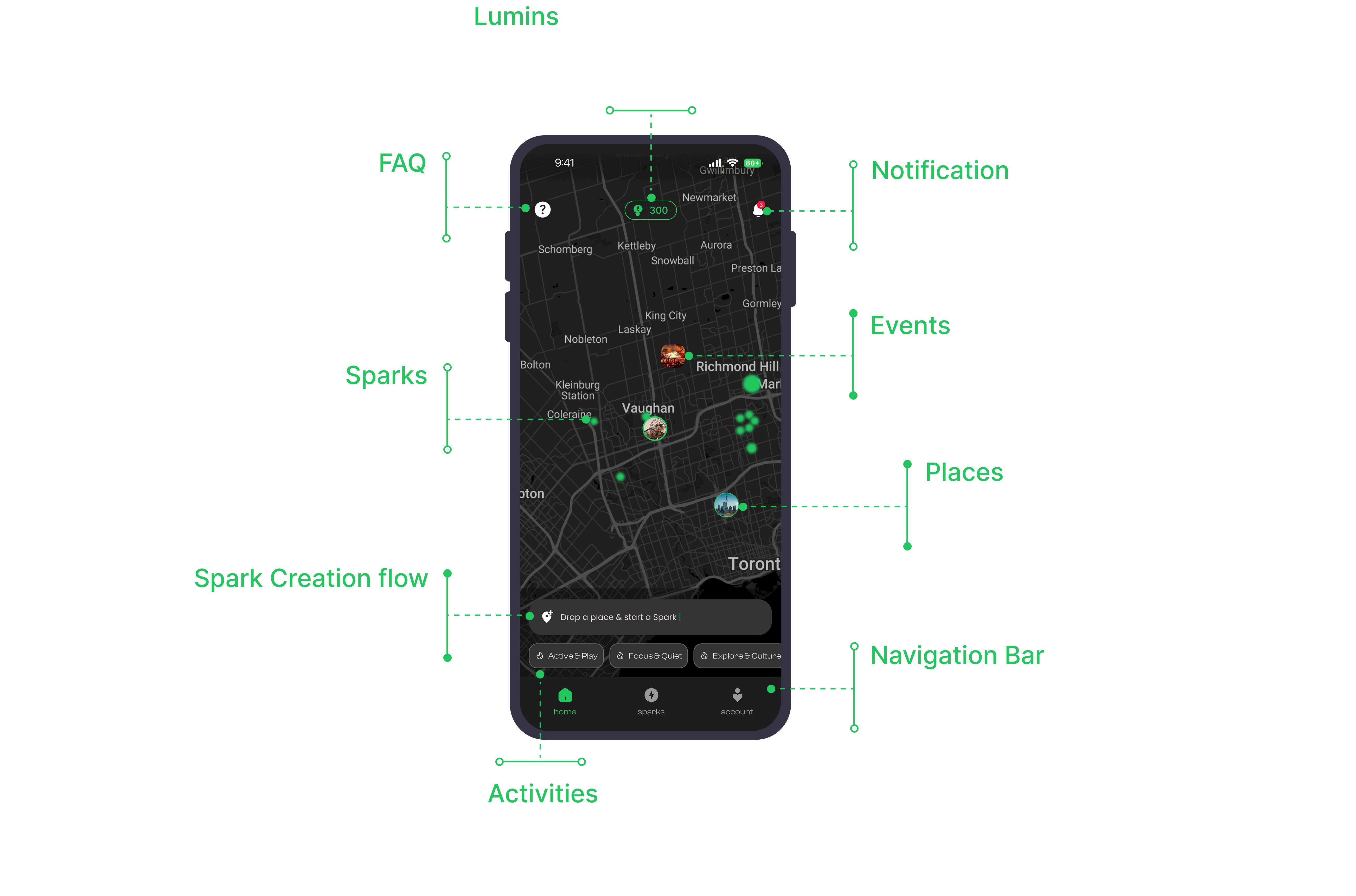
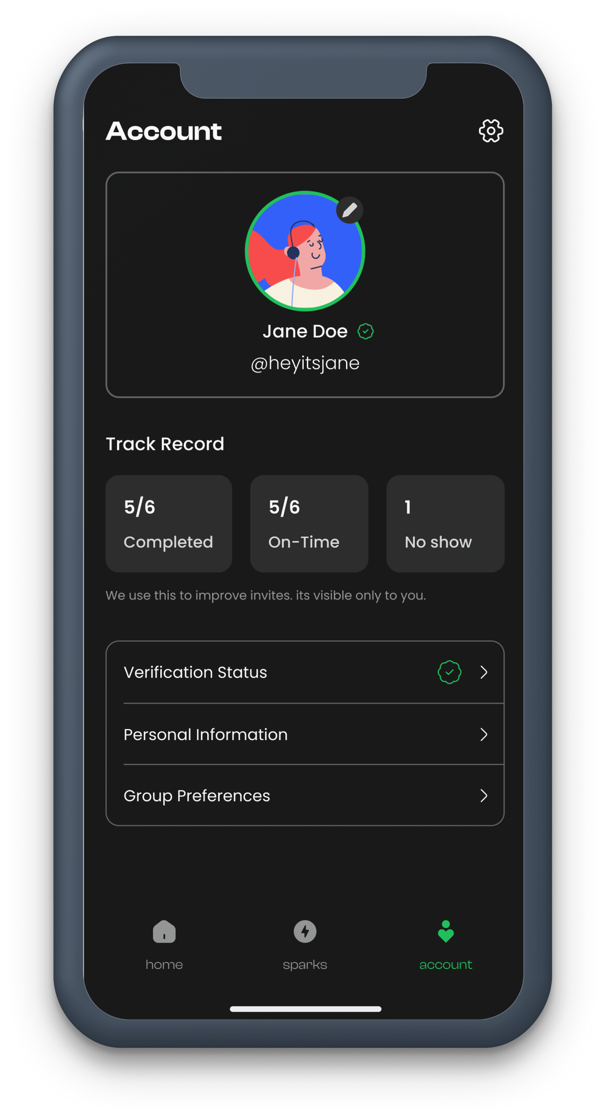
UI Elements
Design Systems
A comprehensive component library ensuring consistency across every screen — buttons, toggles, navigation elements, and interactive controls.
Text Buttons
Toggles & Controls
Navigation
Danger Buttons
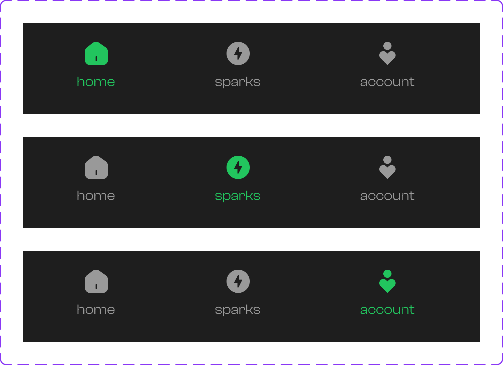
Navigation Bar
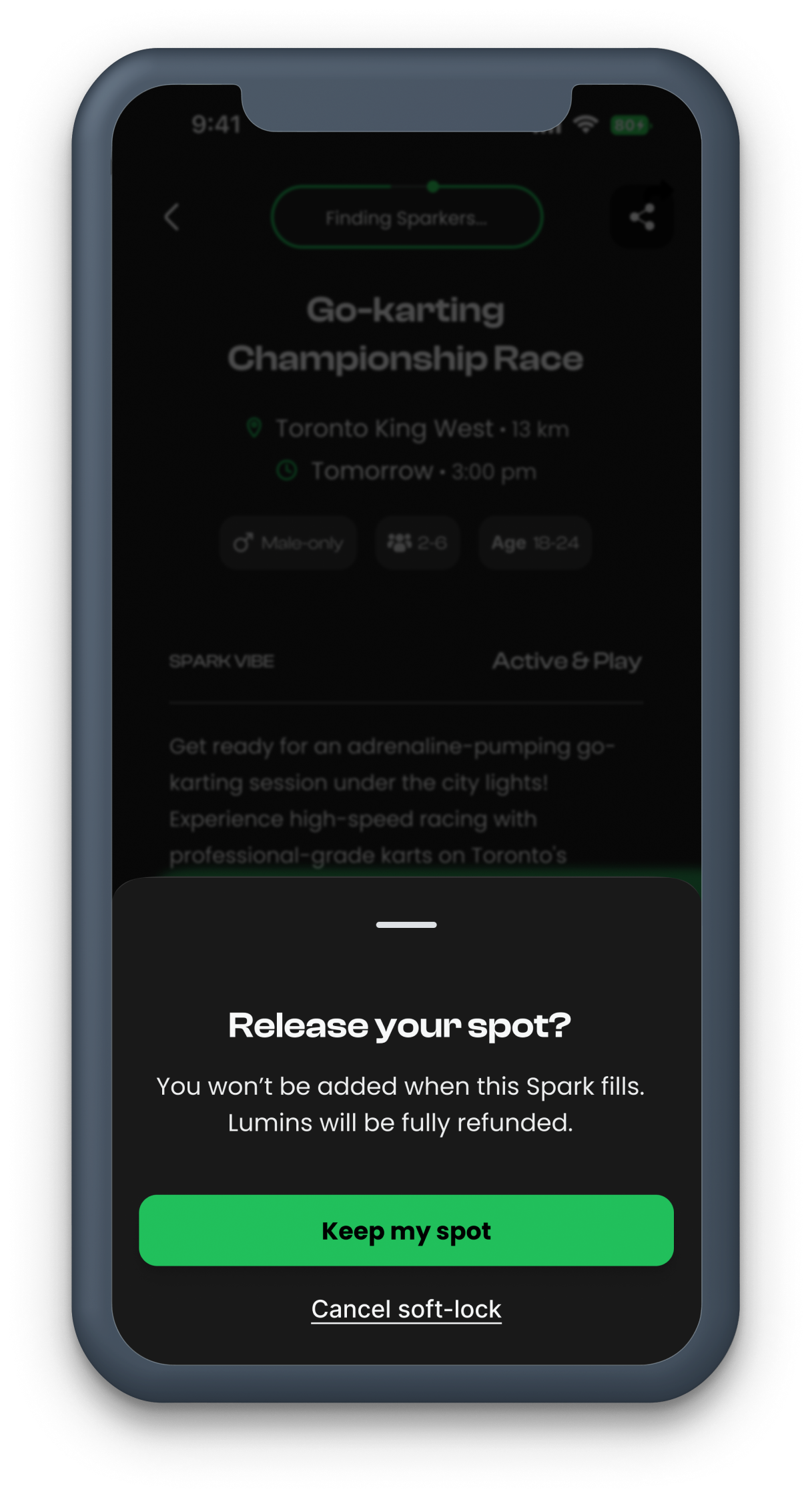
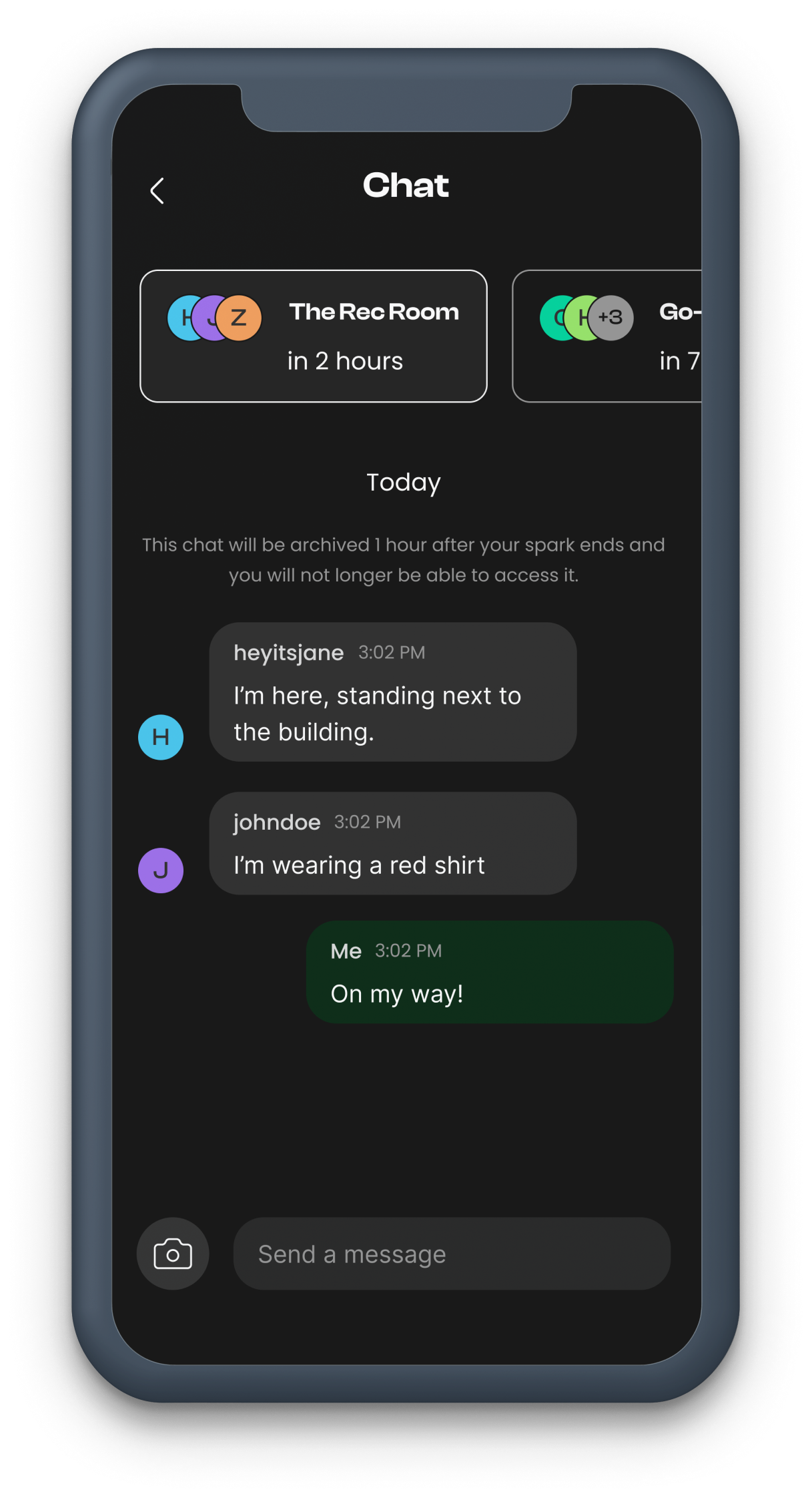
Labels, Badges & Cards
Alex M.
2 km away
Music lover, coffee addict ☕
Profile updated successfully
New feature available
Learn more
Notifications
New match found!
Someone liked your spark
Connection lost
Check your network settings
Input Fields
Information Architecture
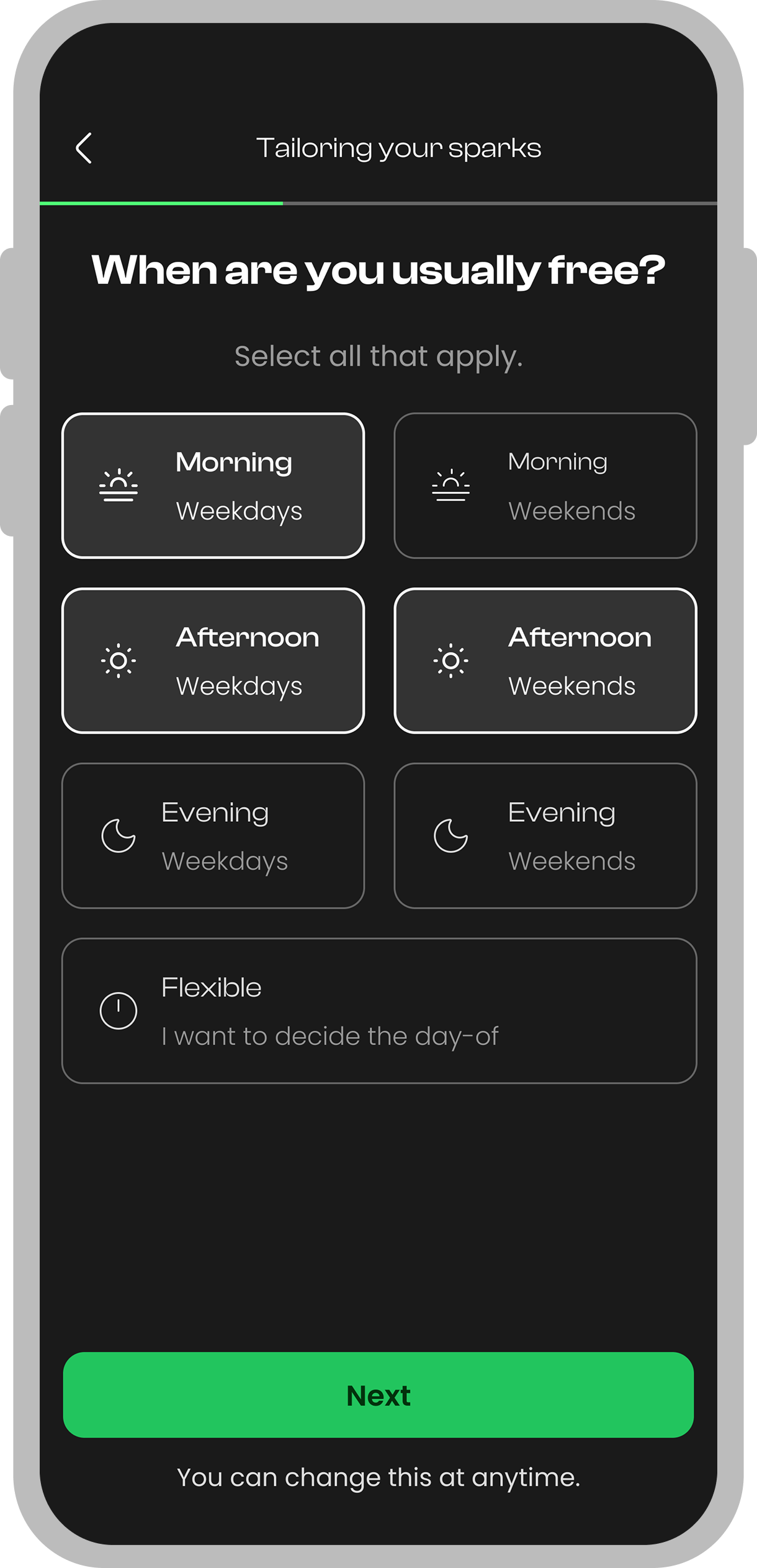
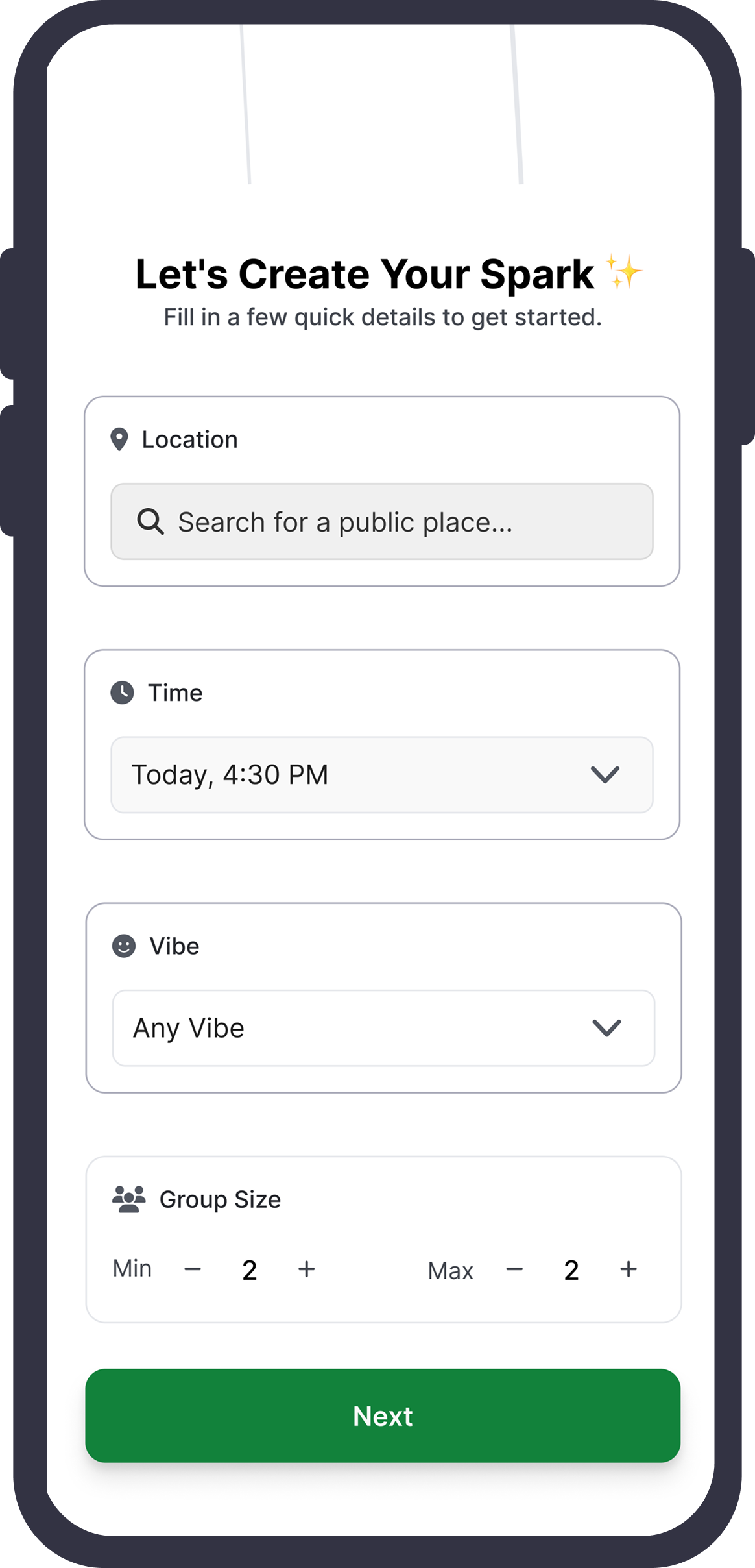
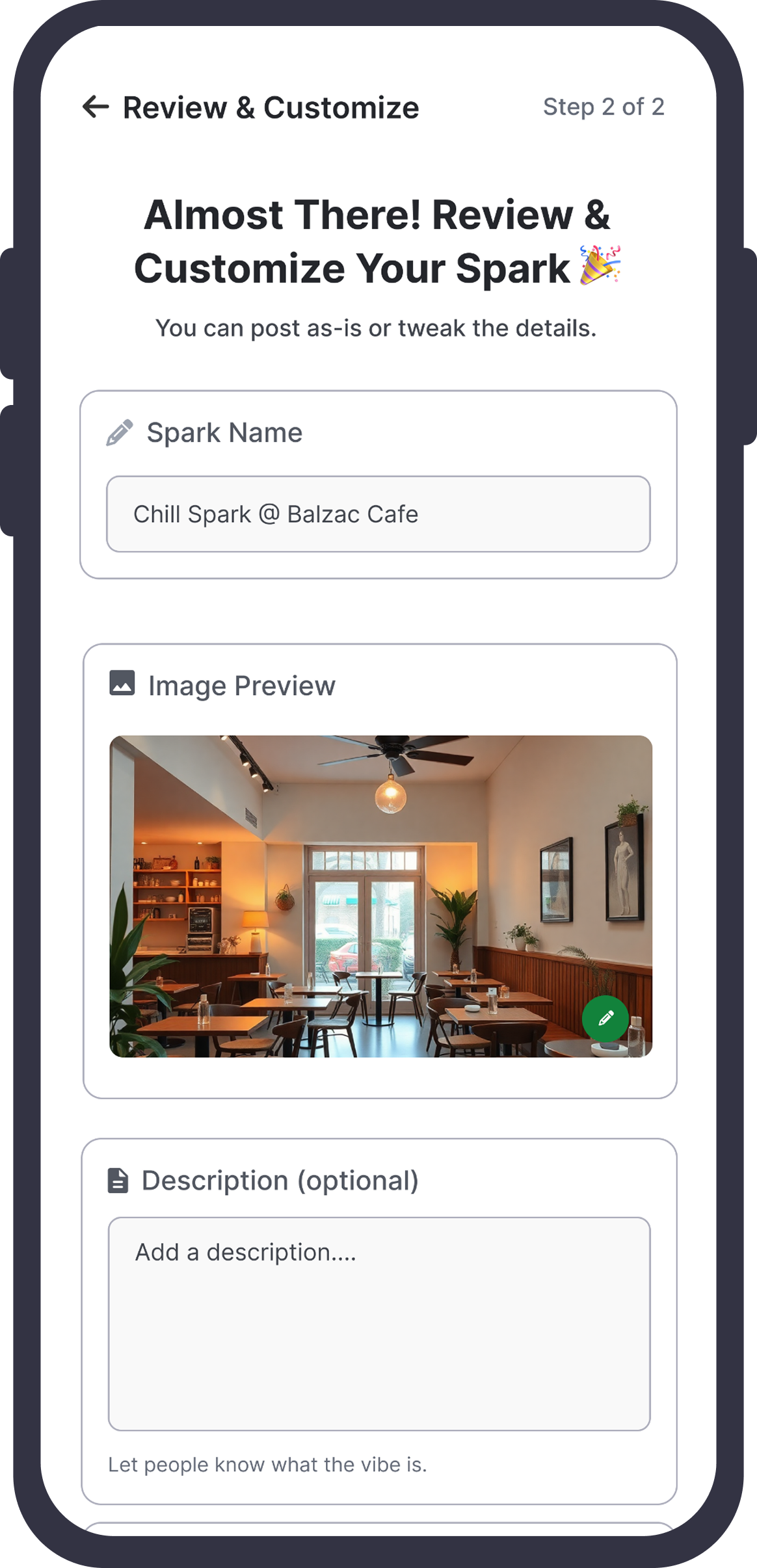
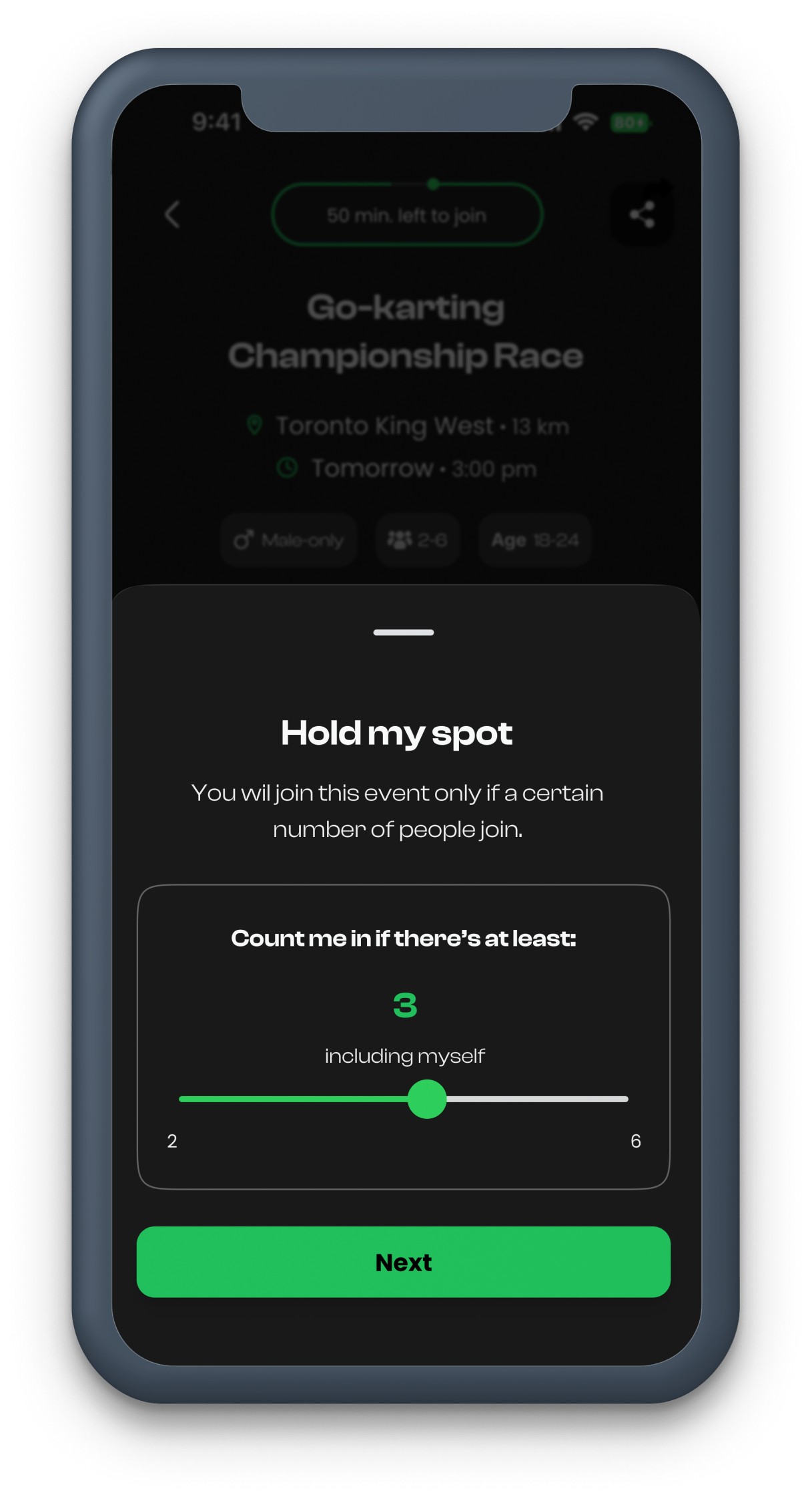
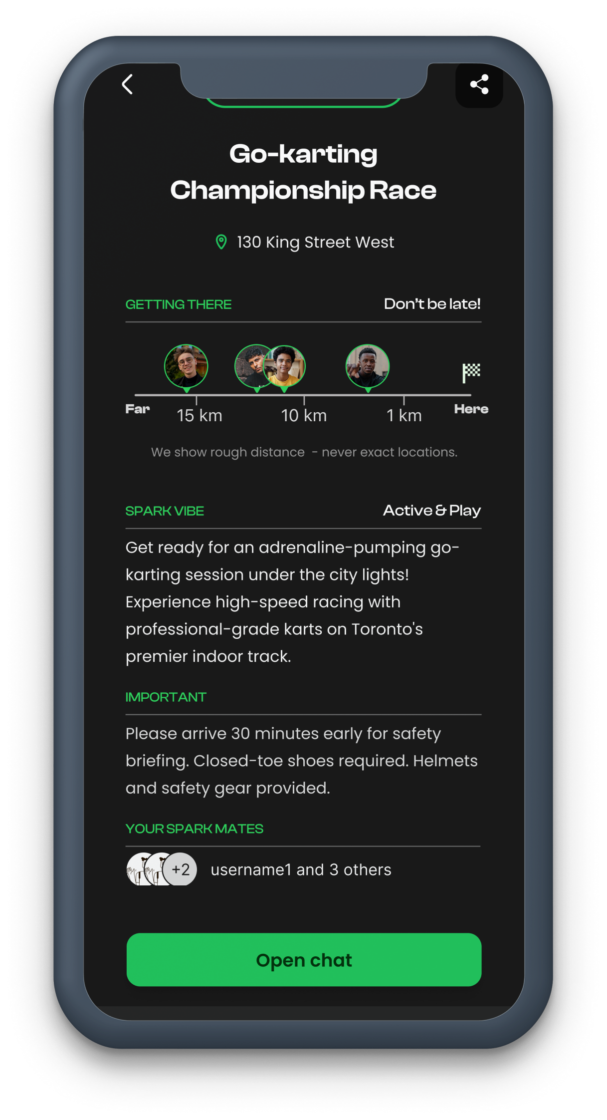
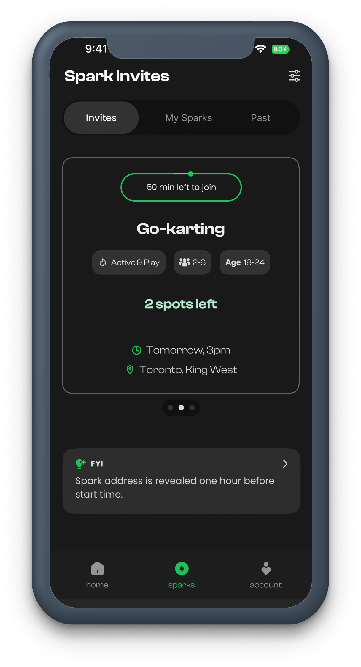
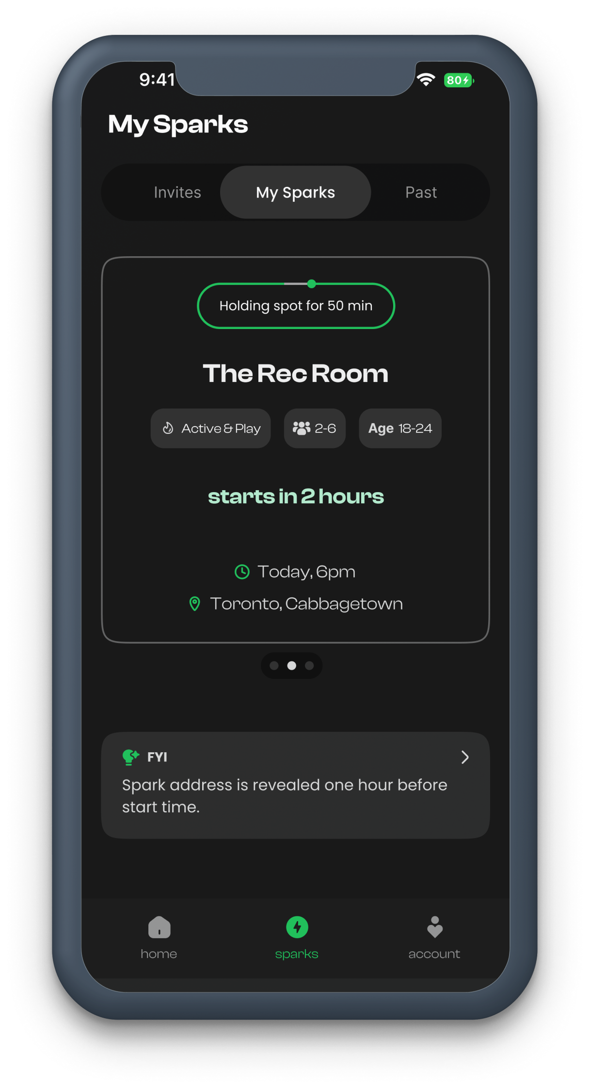
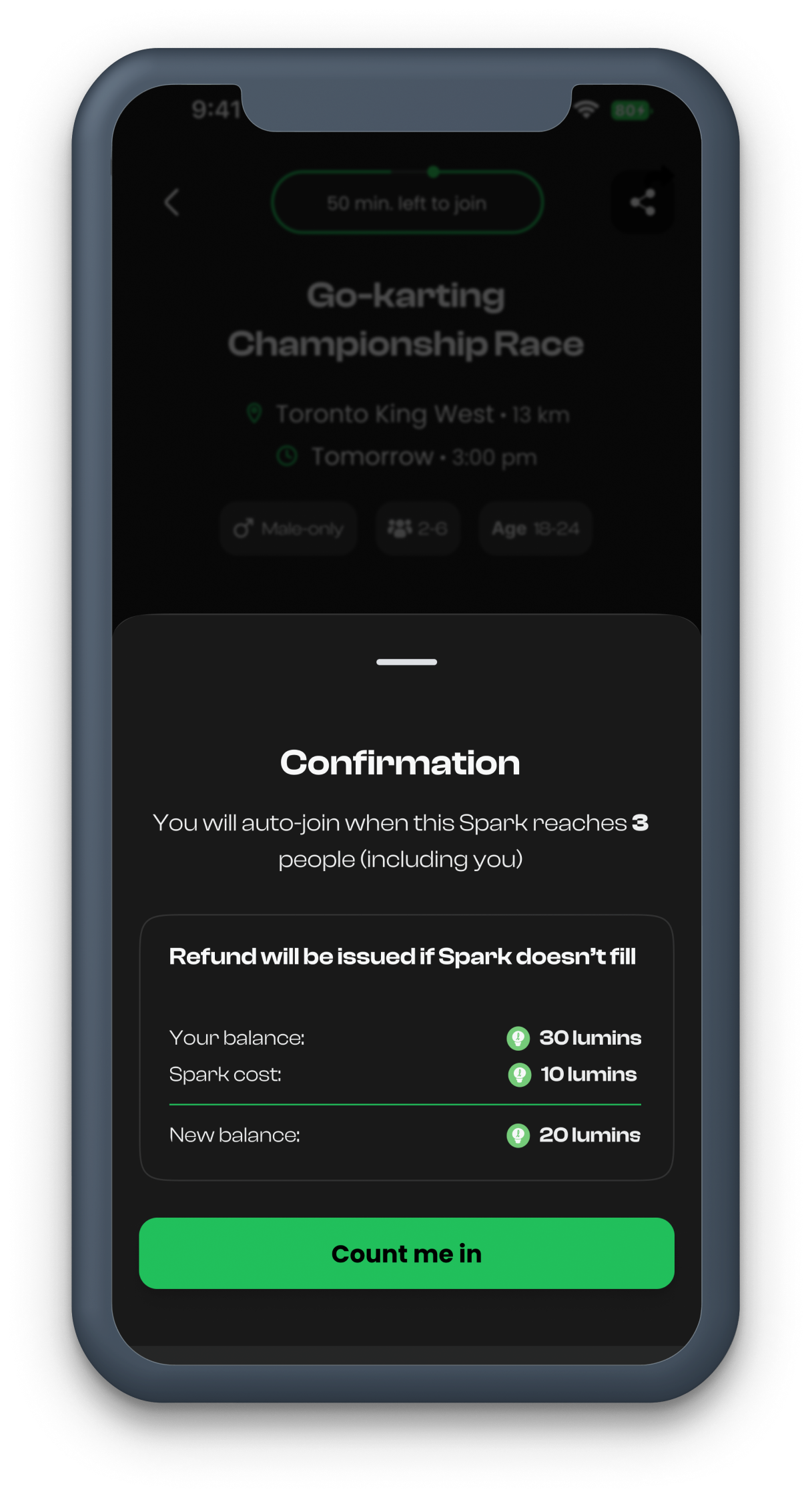
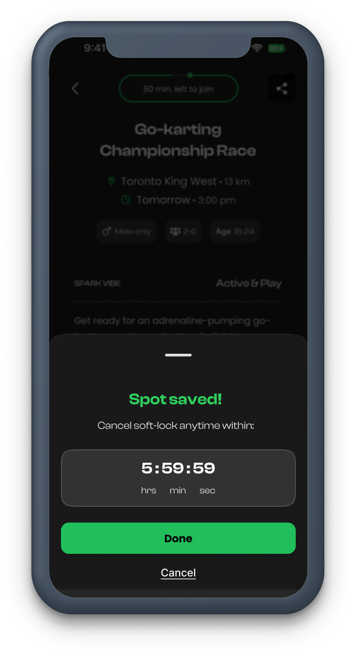
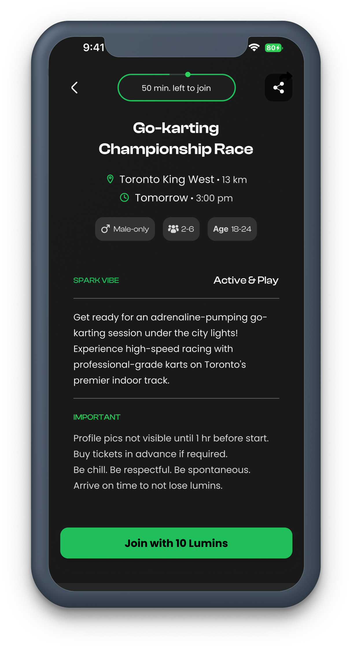
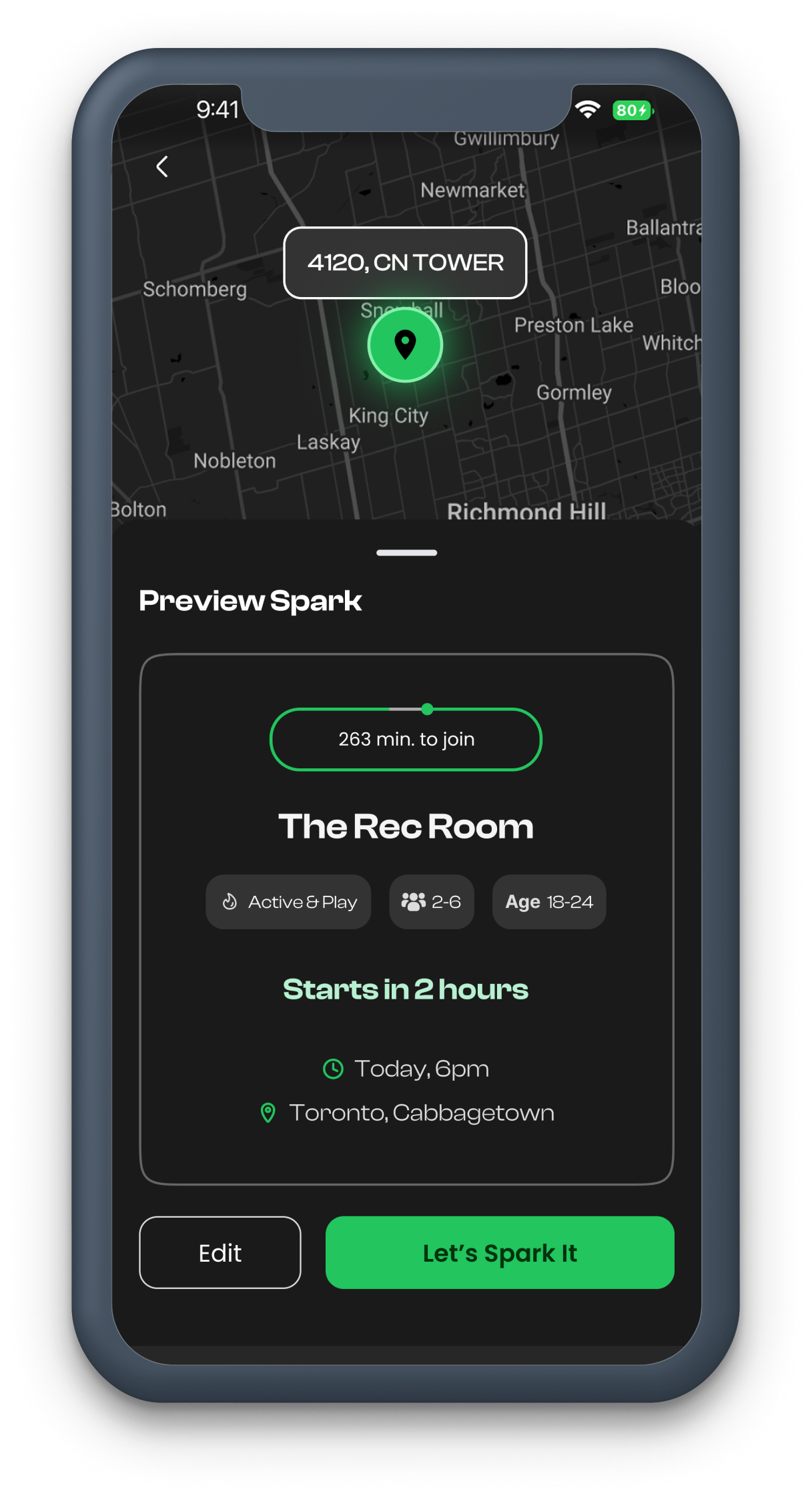
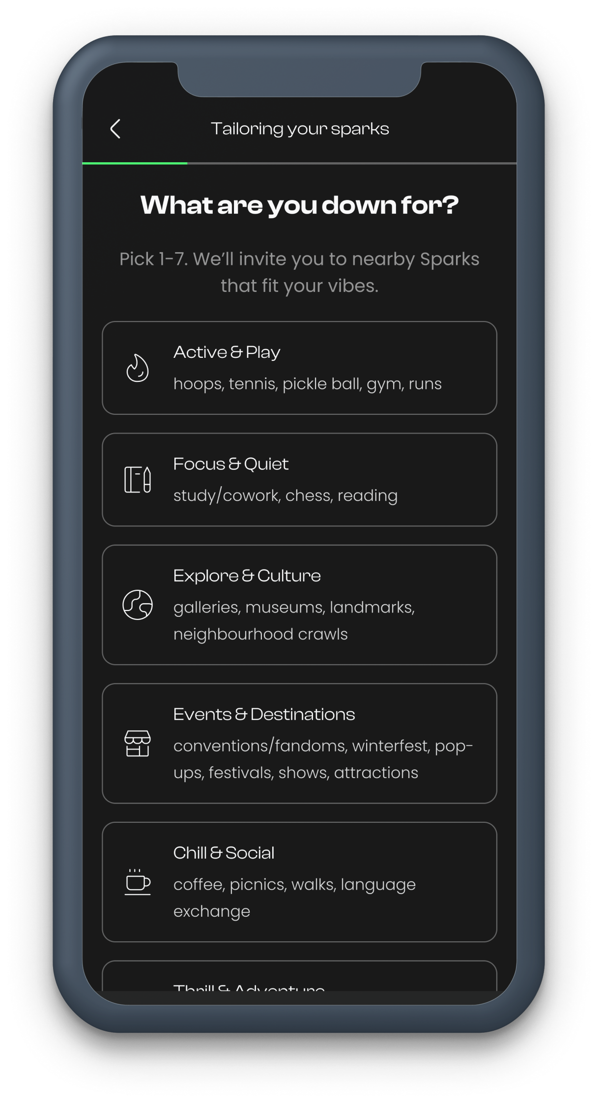
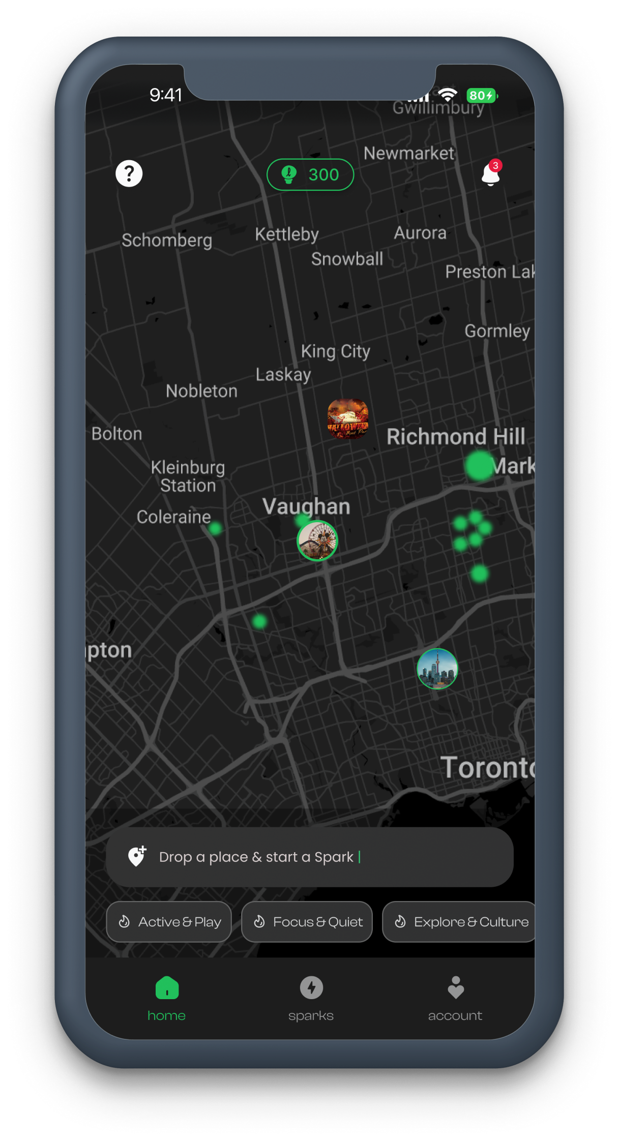
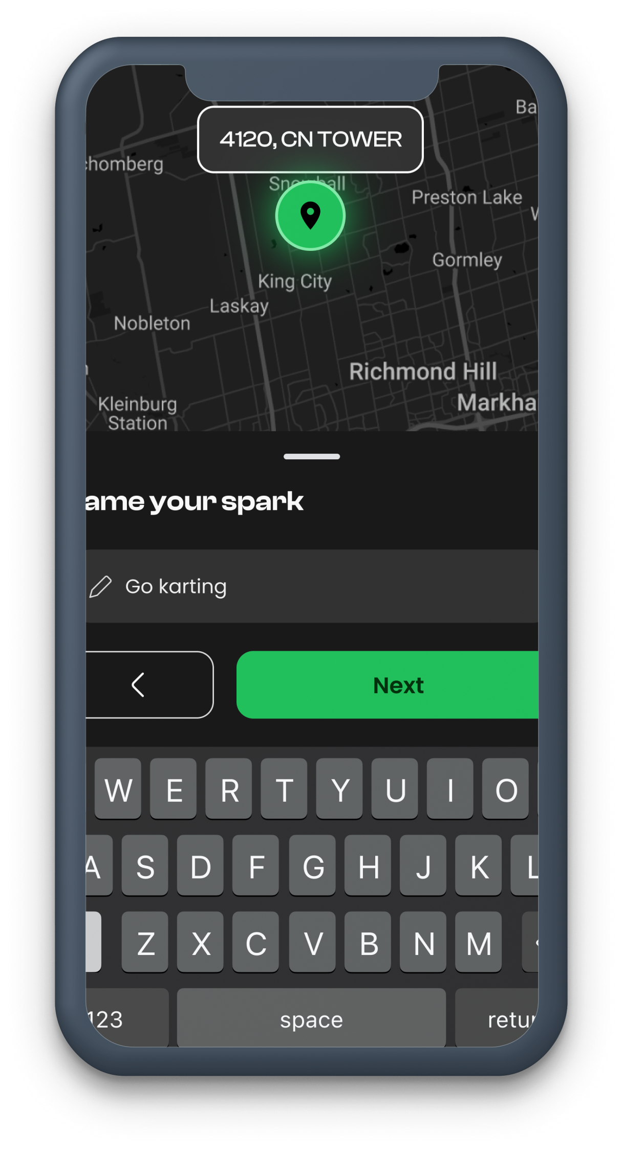
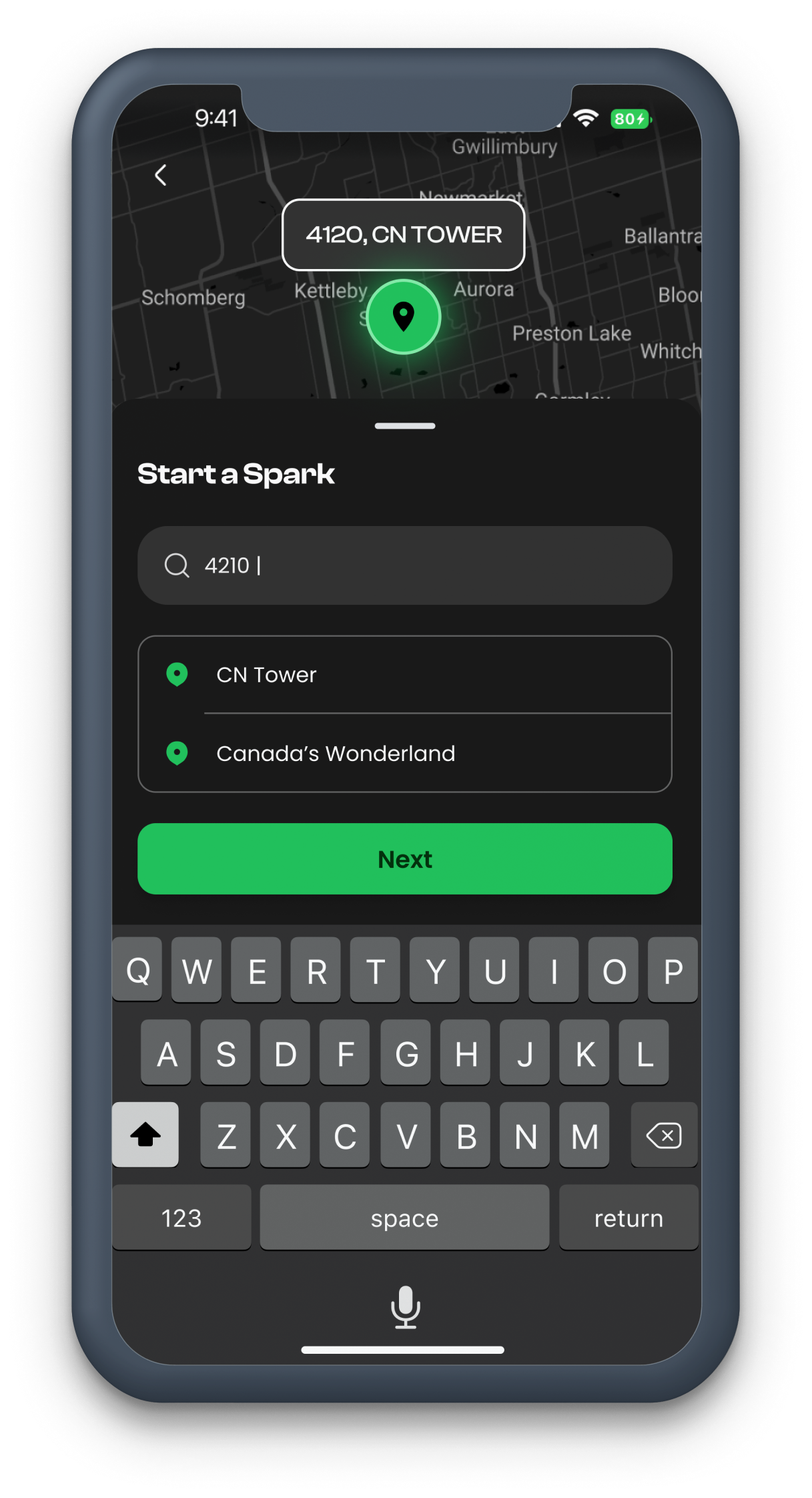
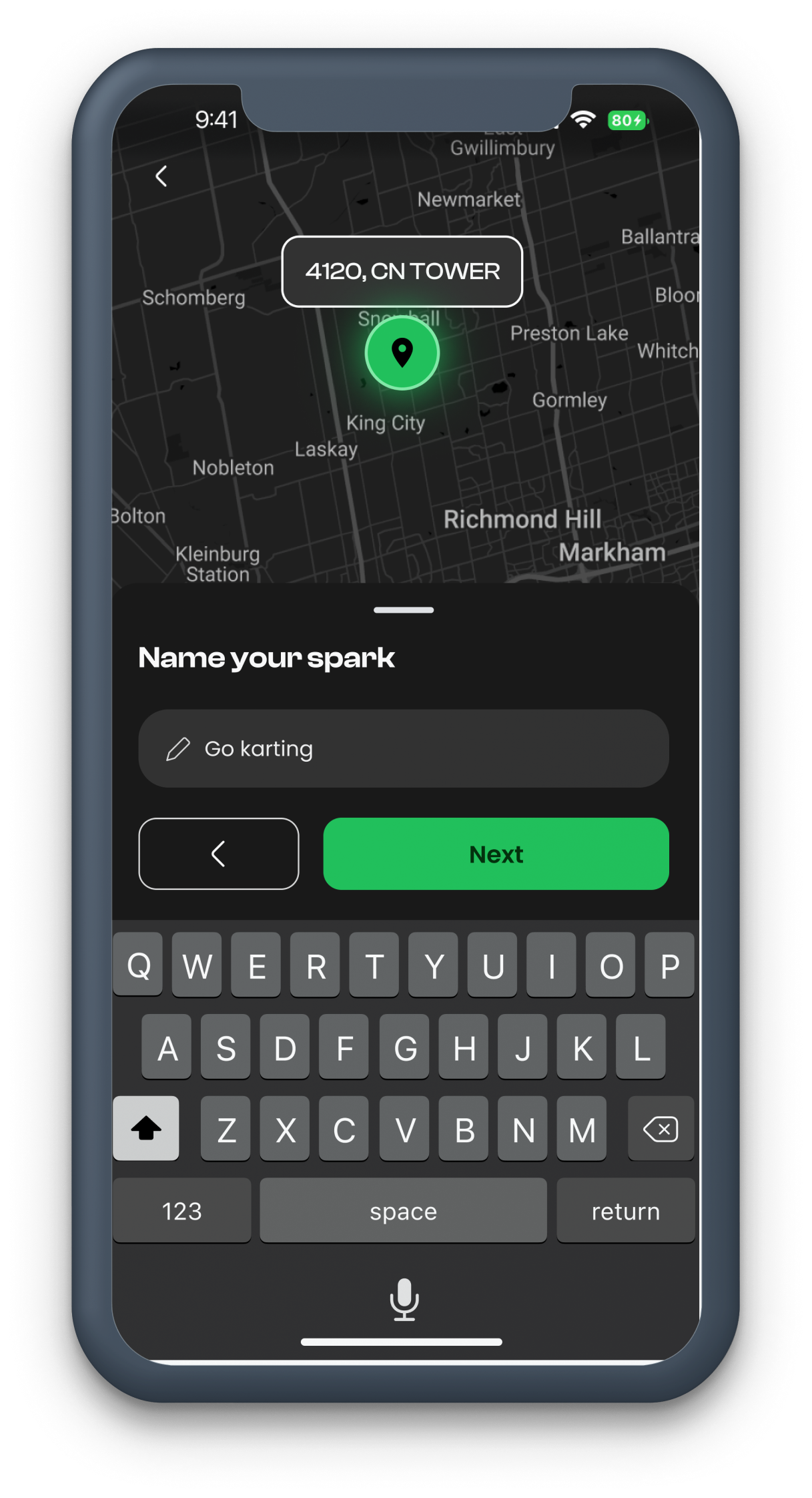
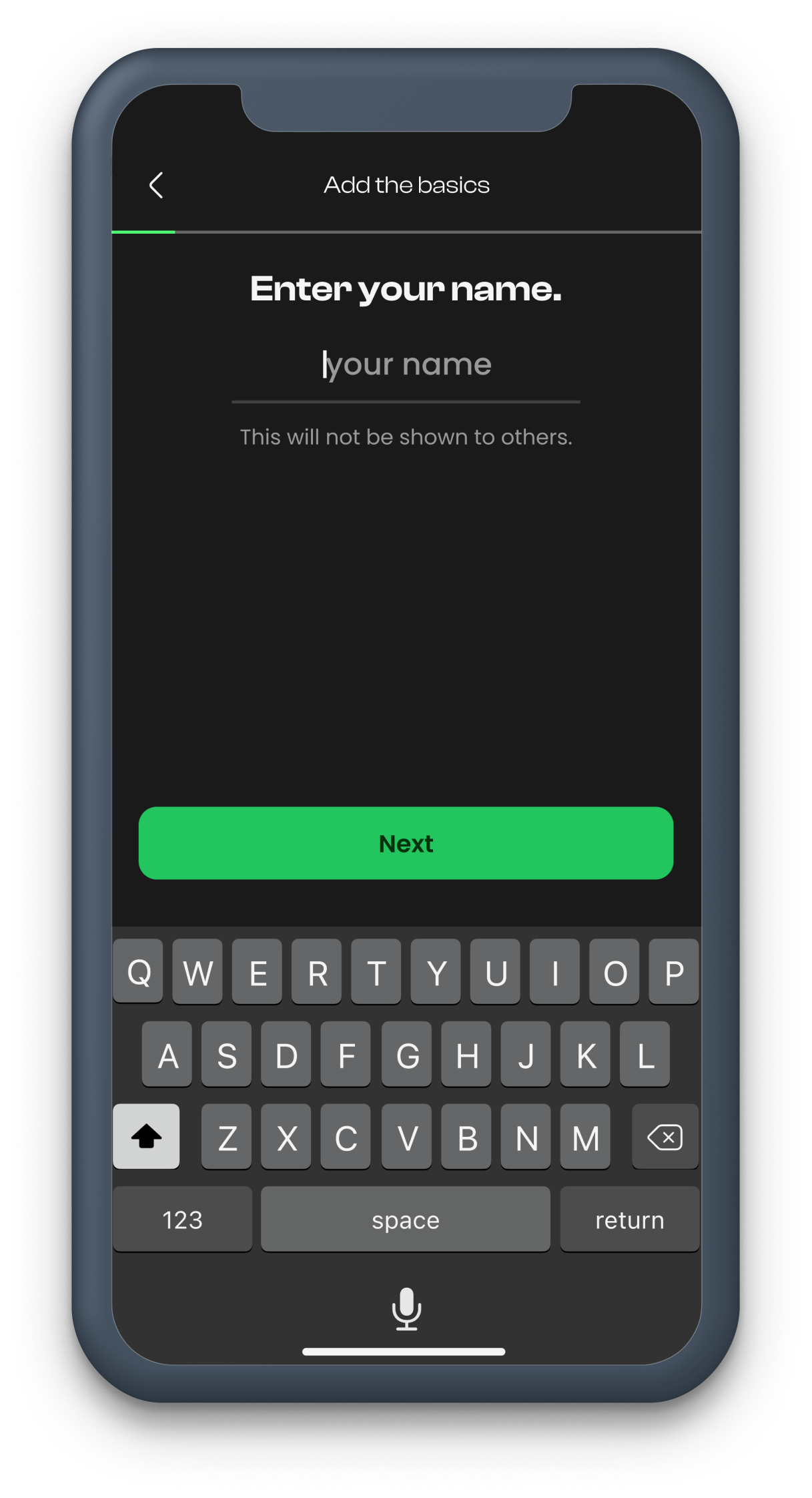
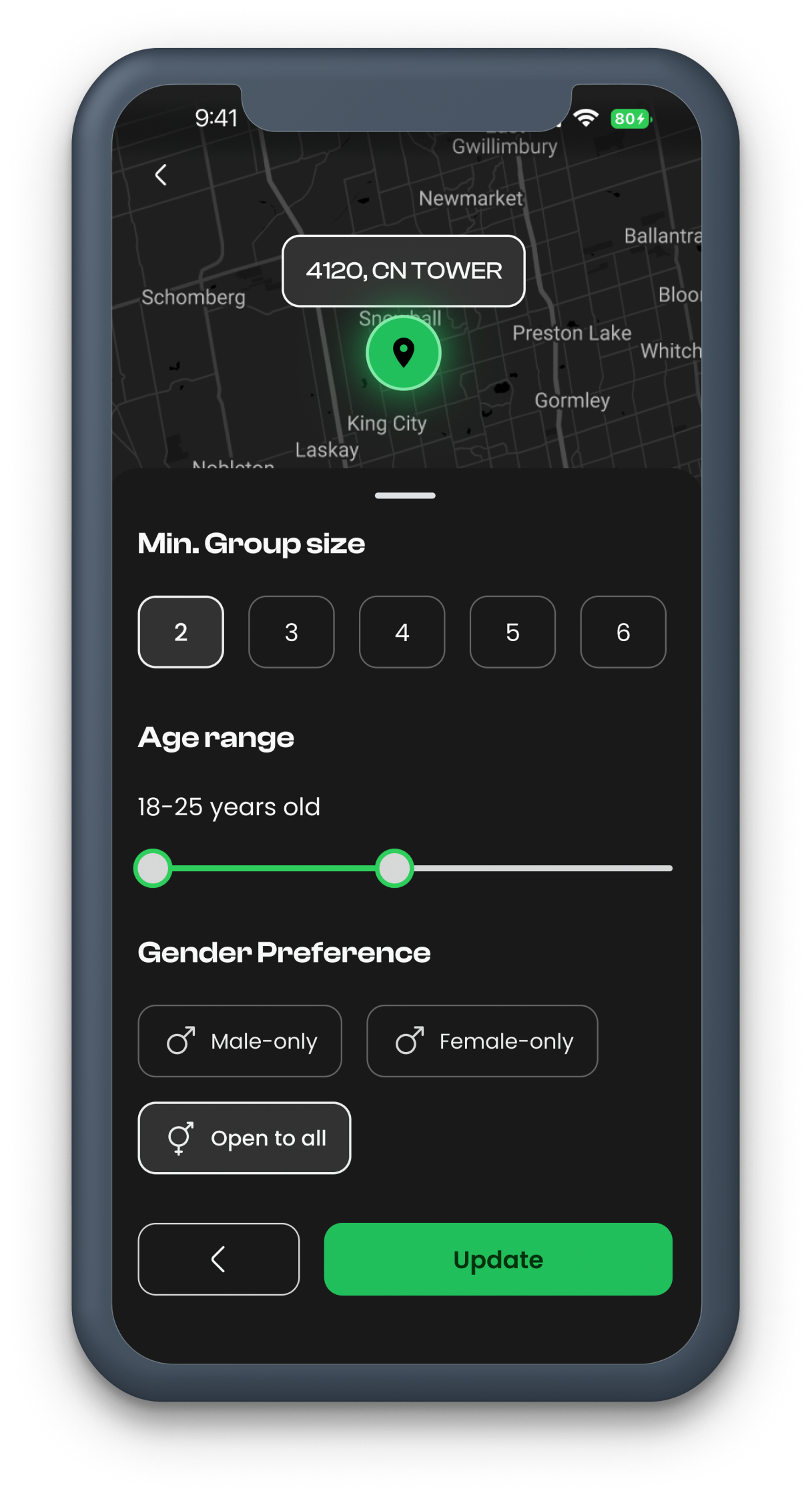
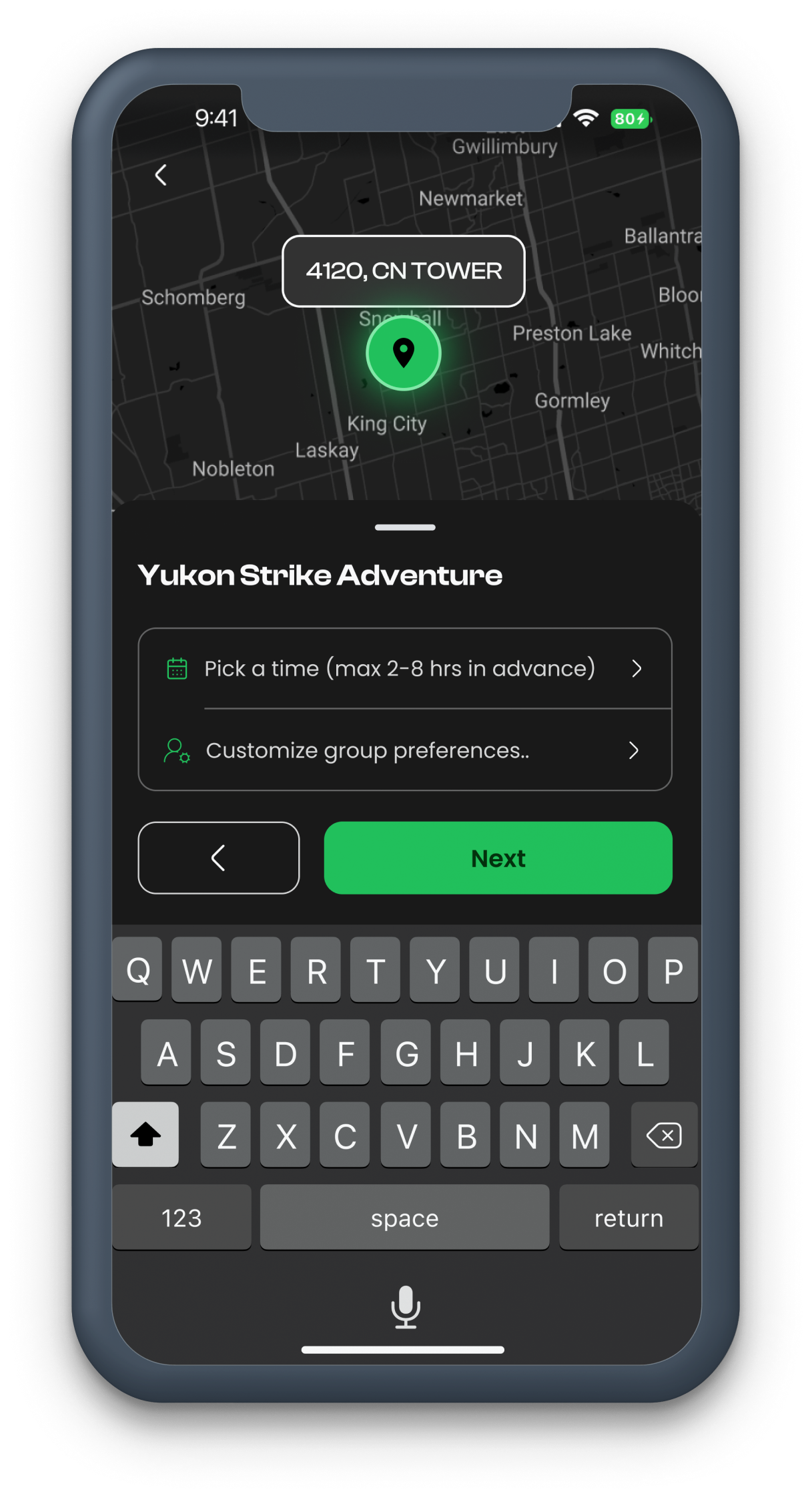
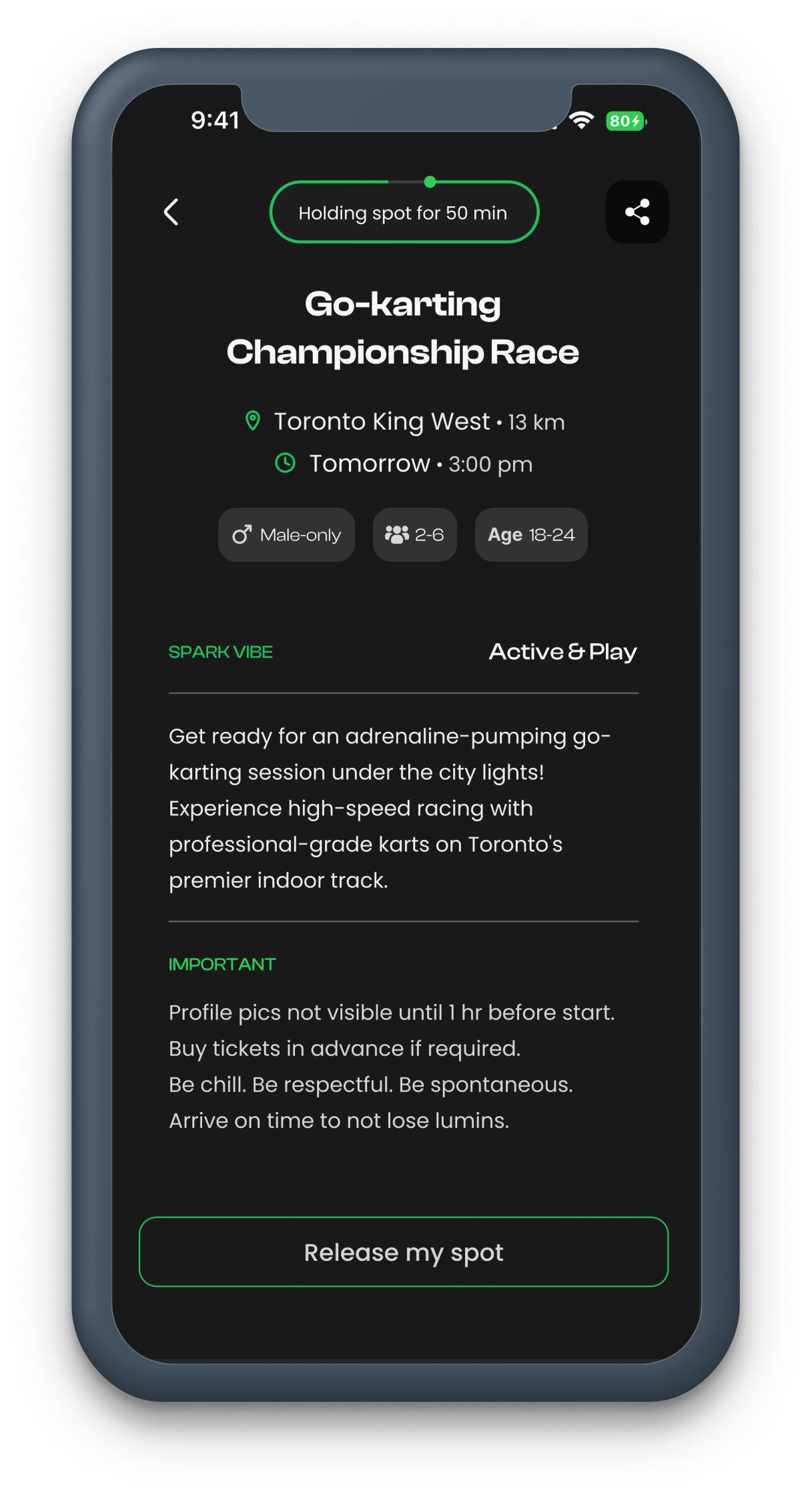
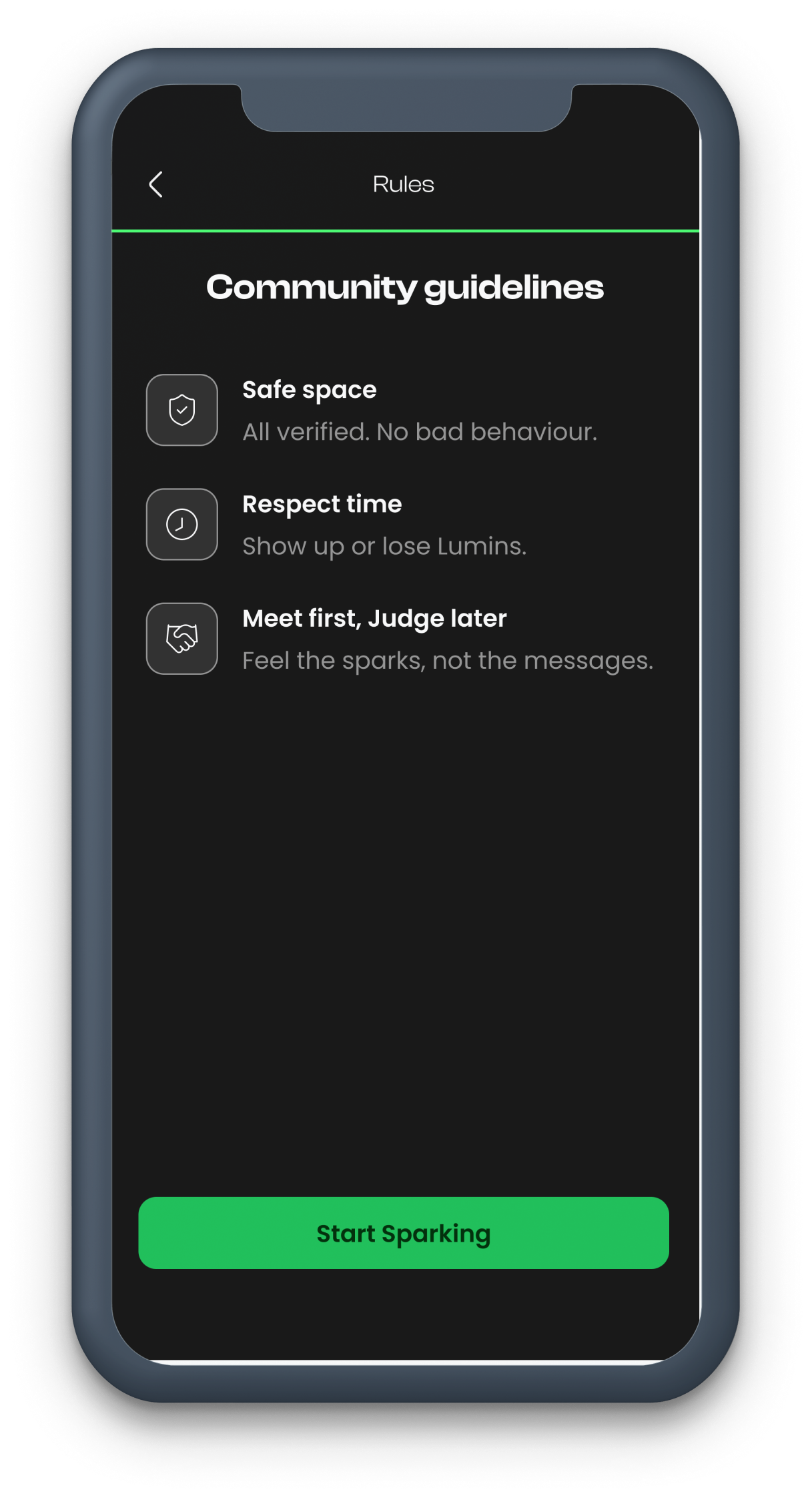
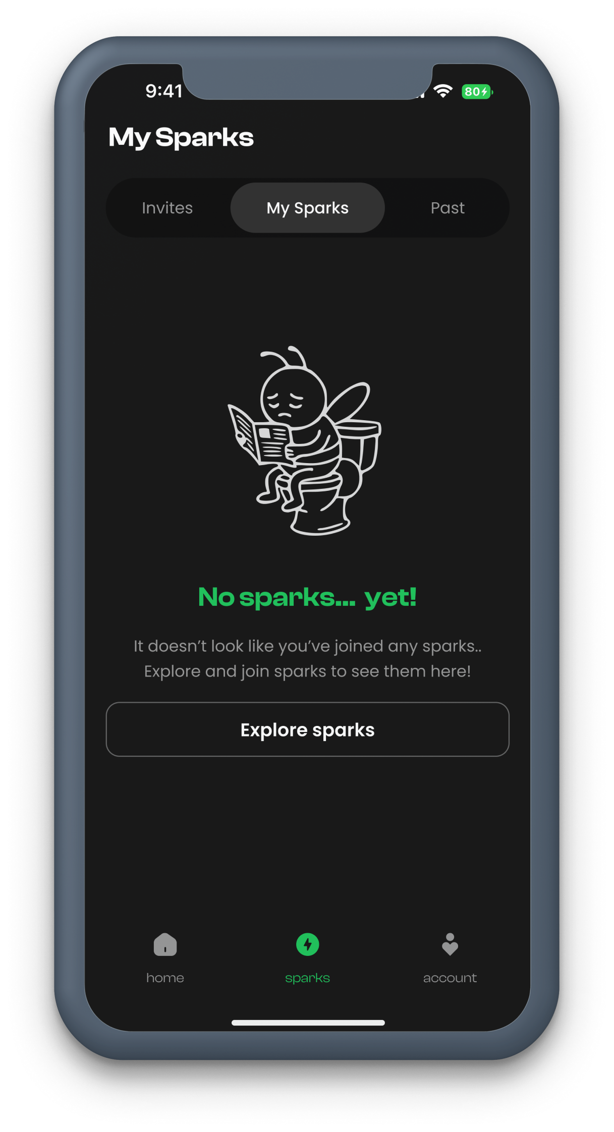
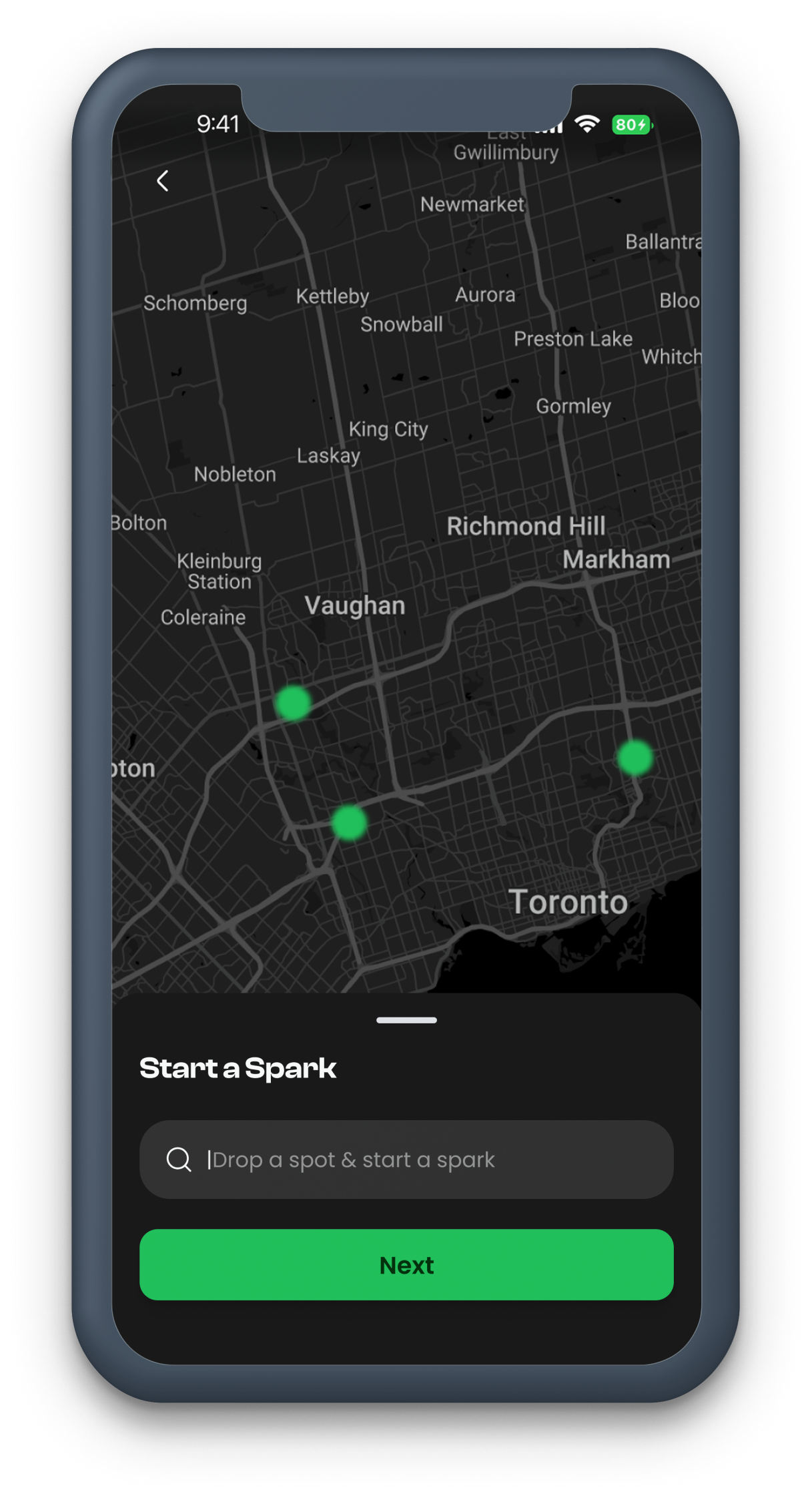
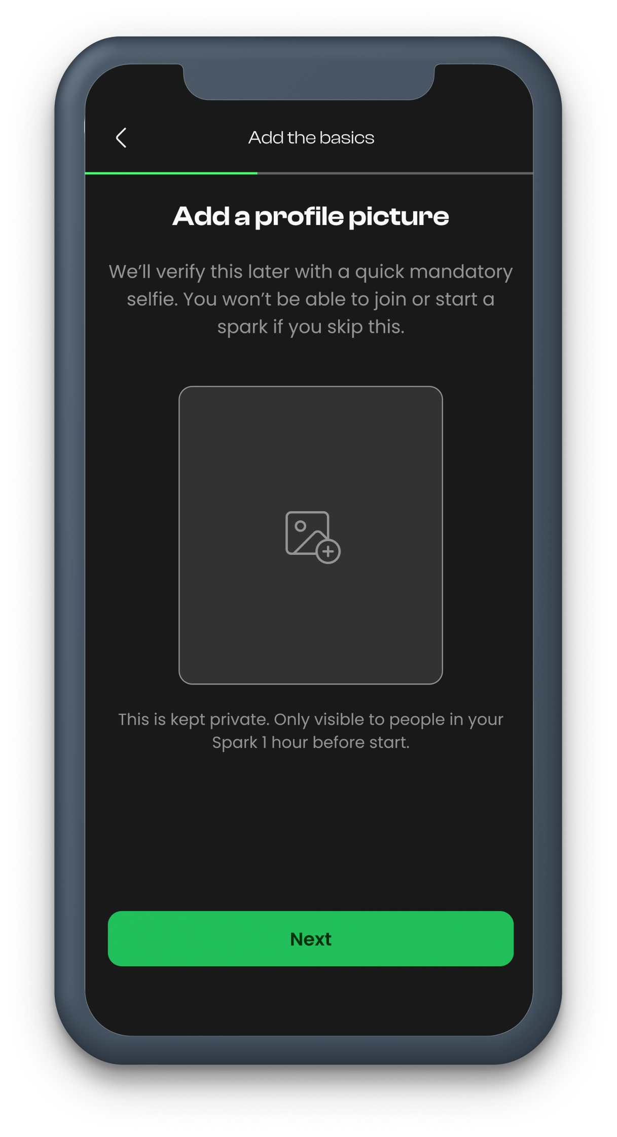
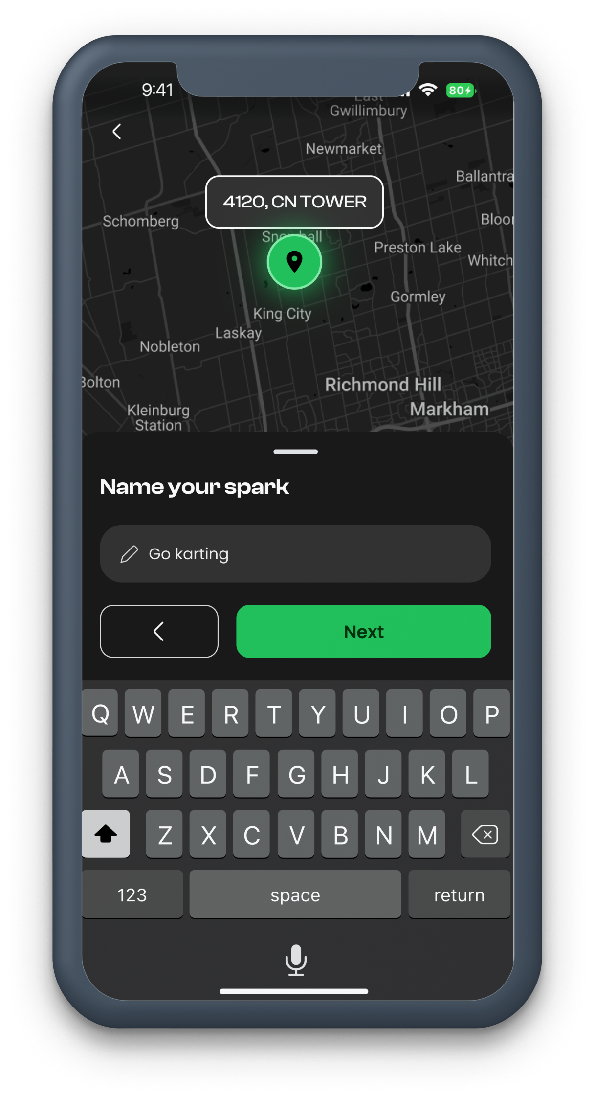
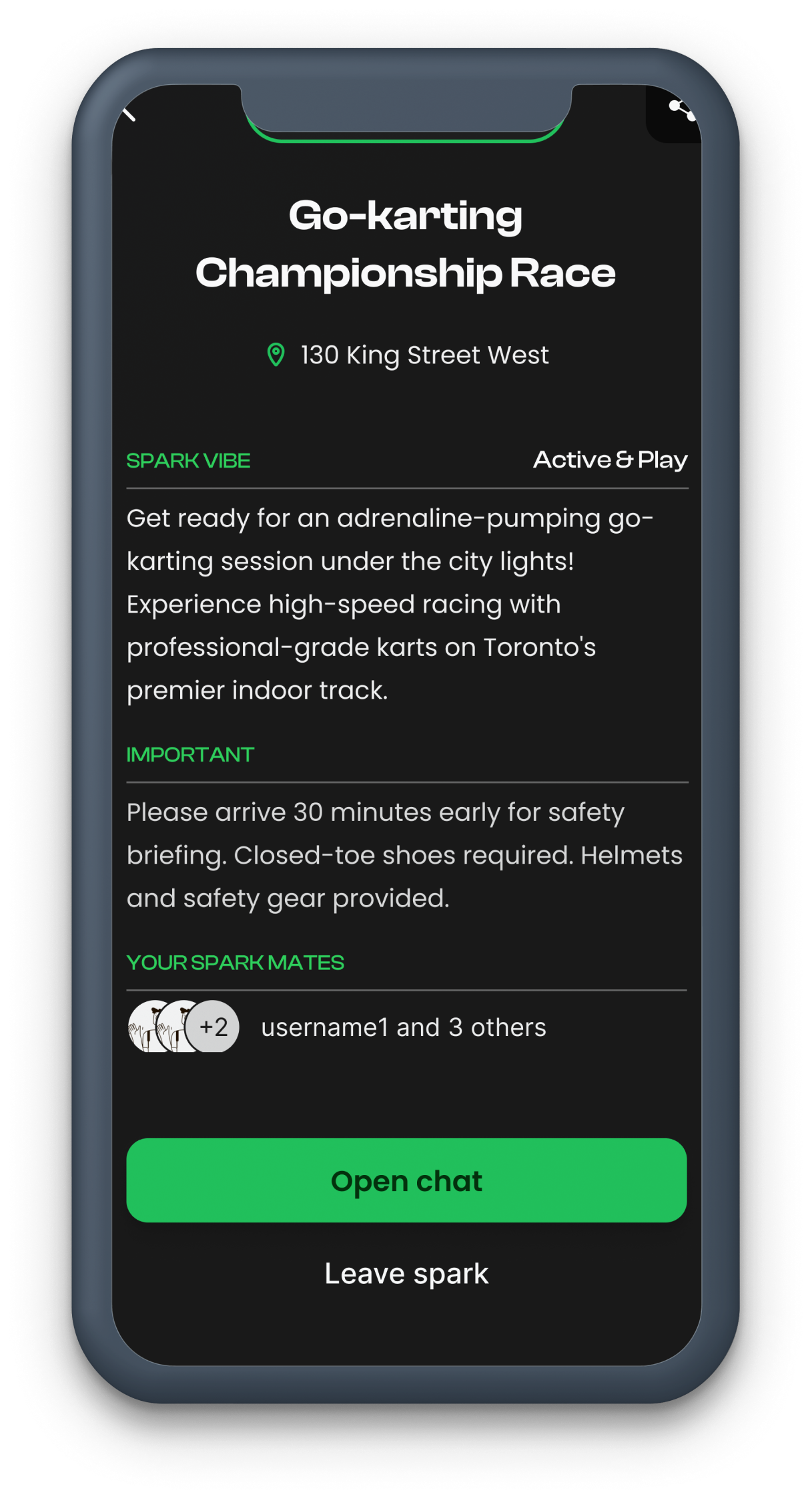
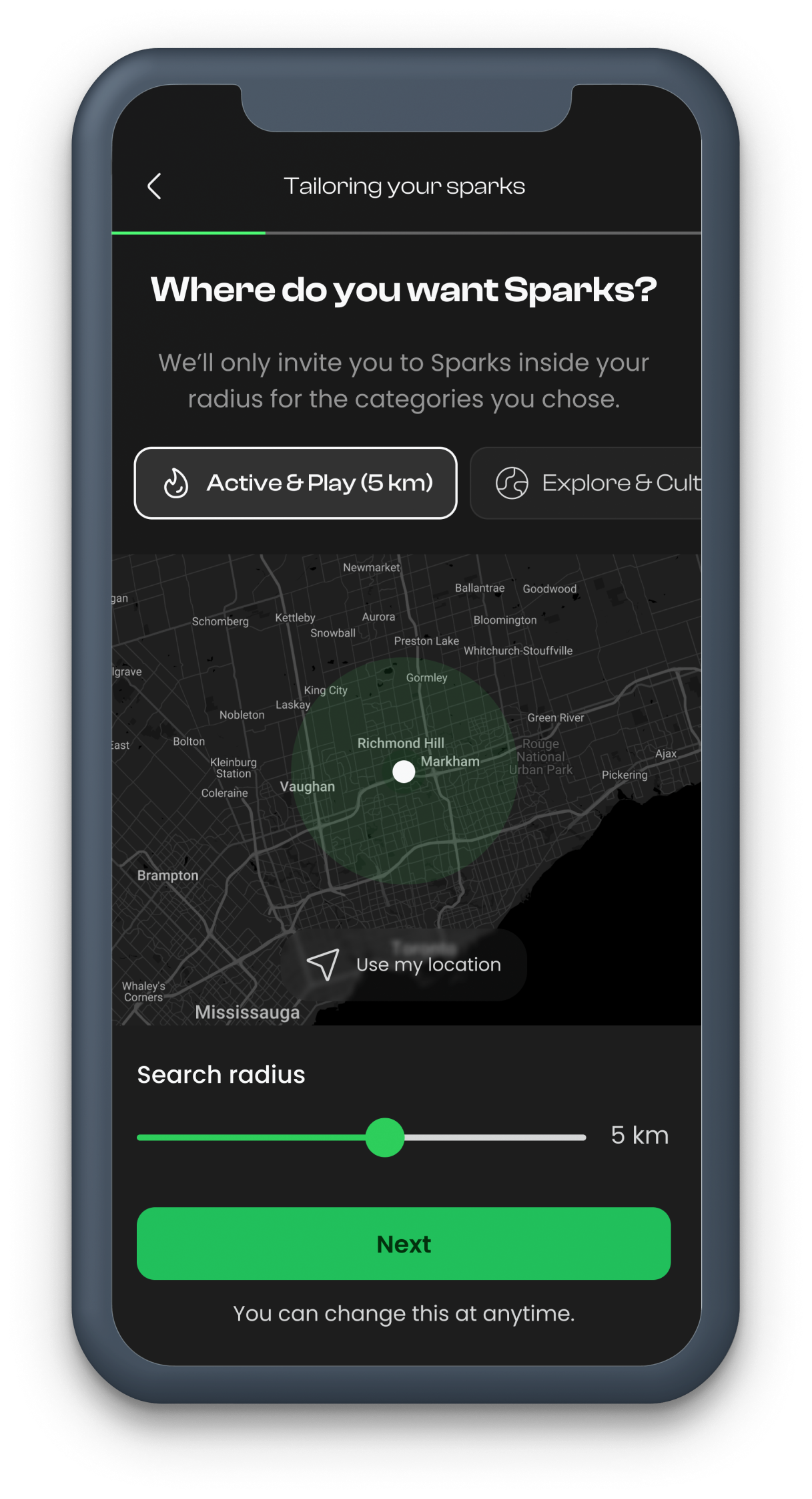
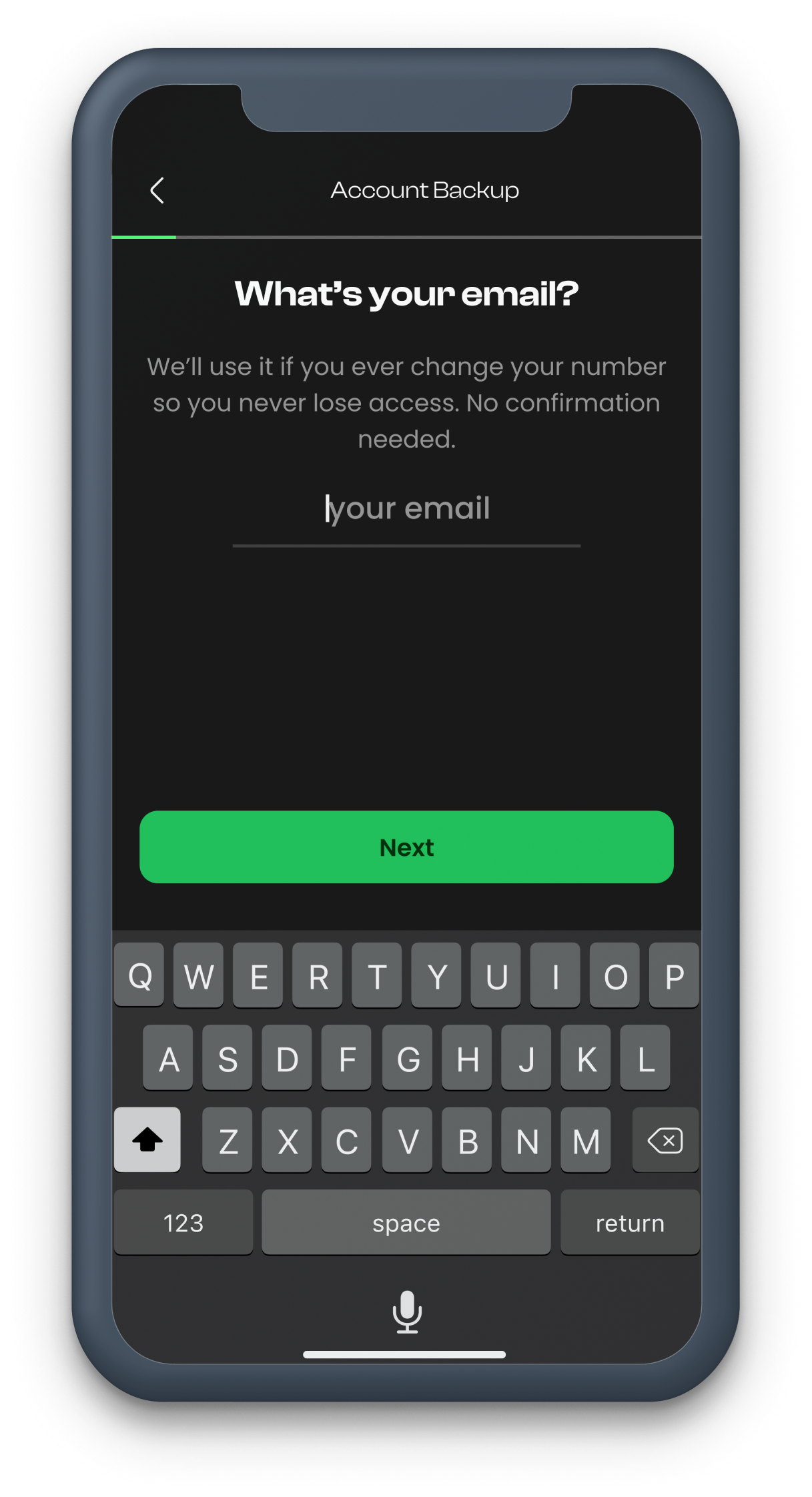
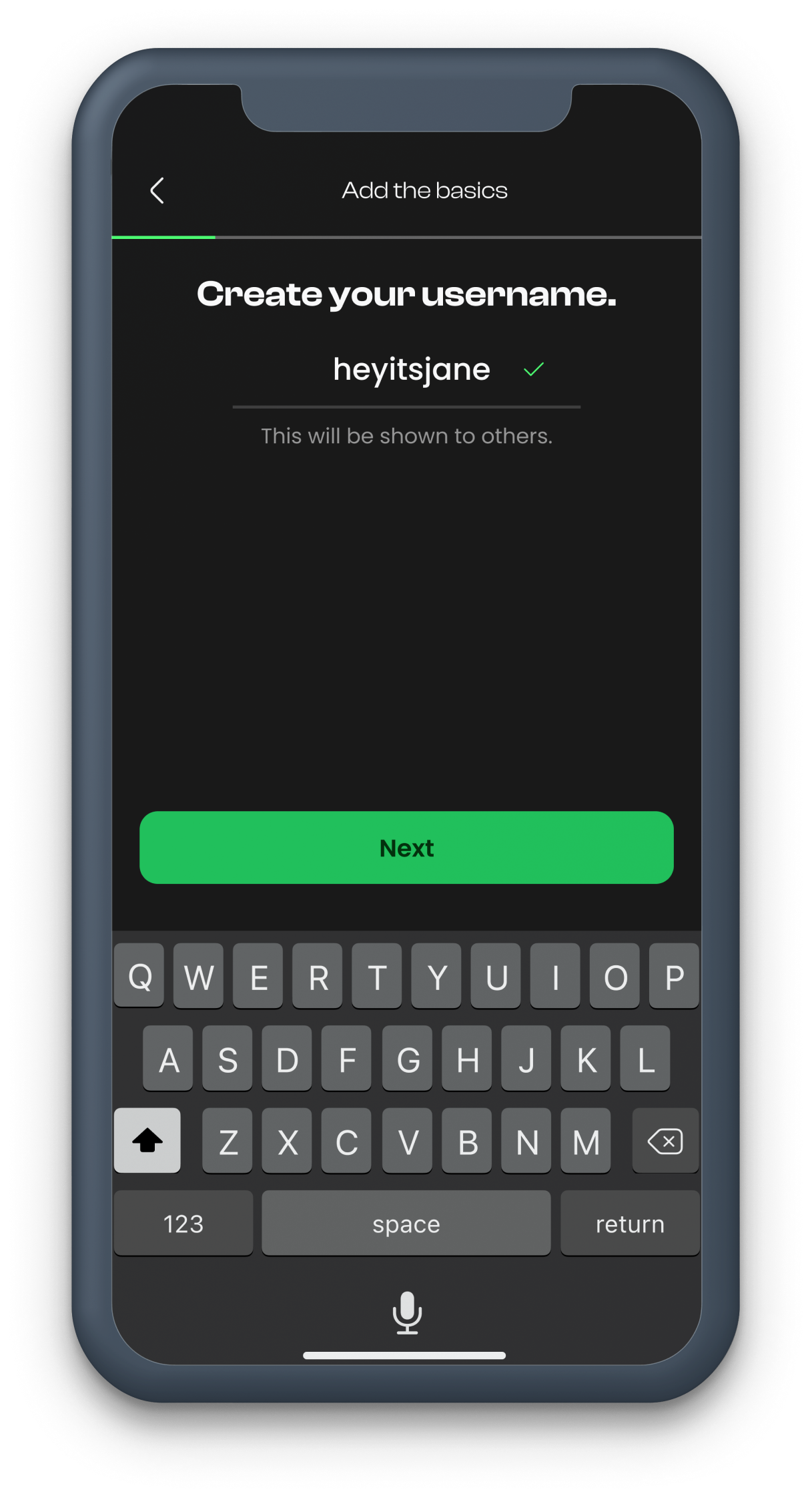
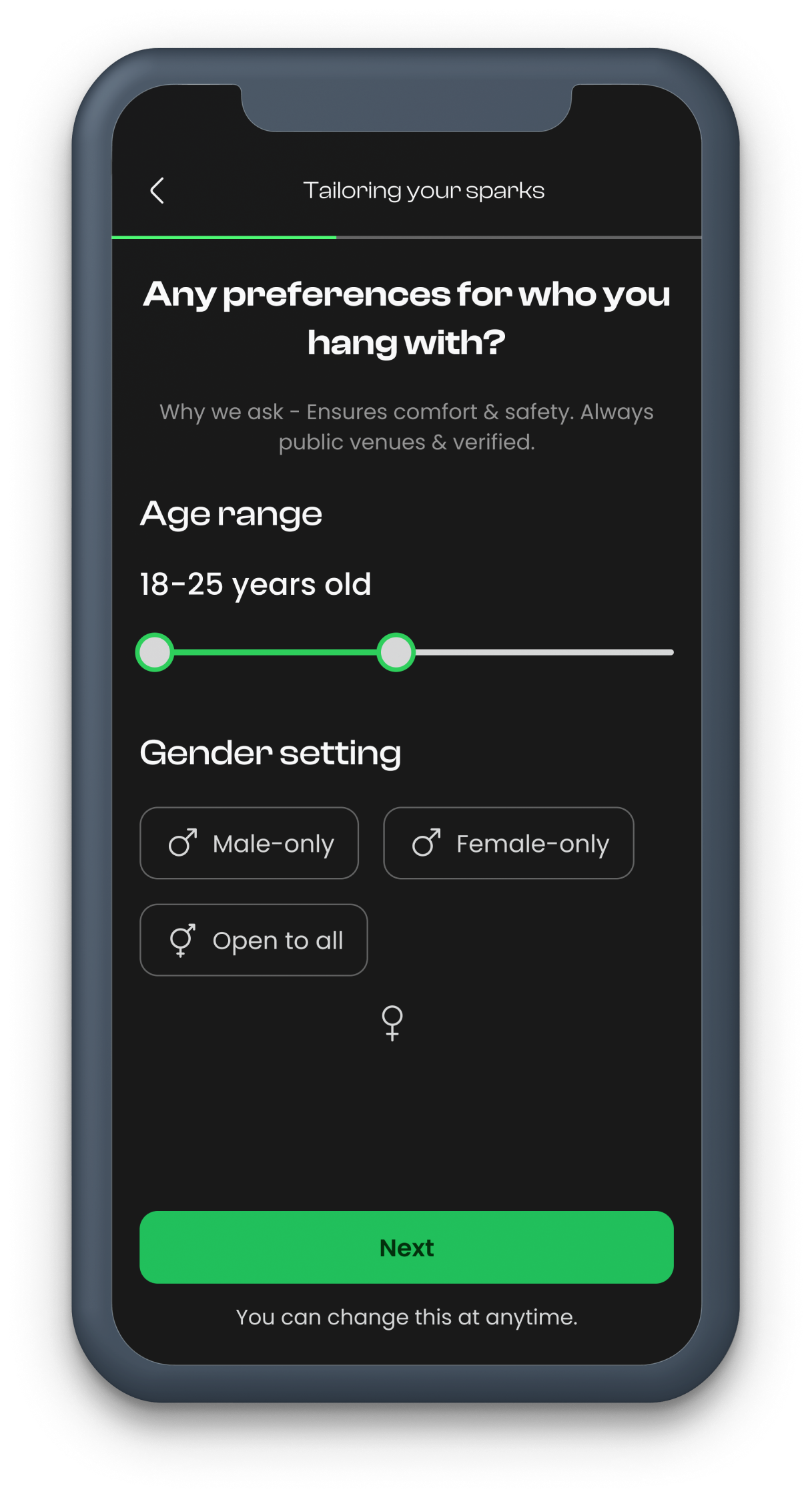
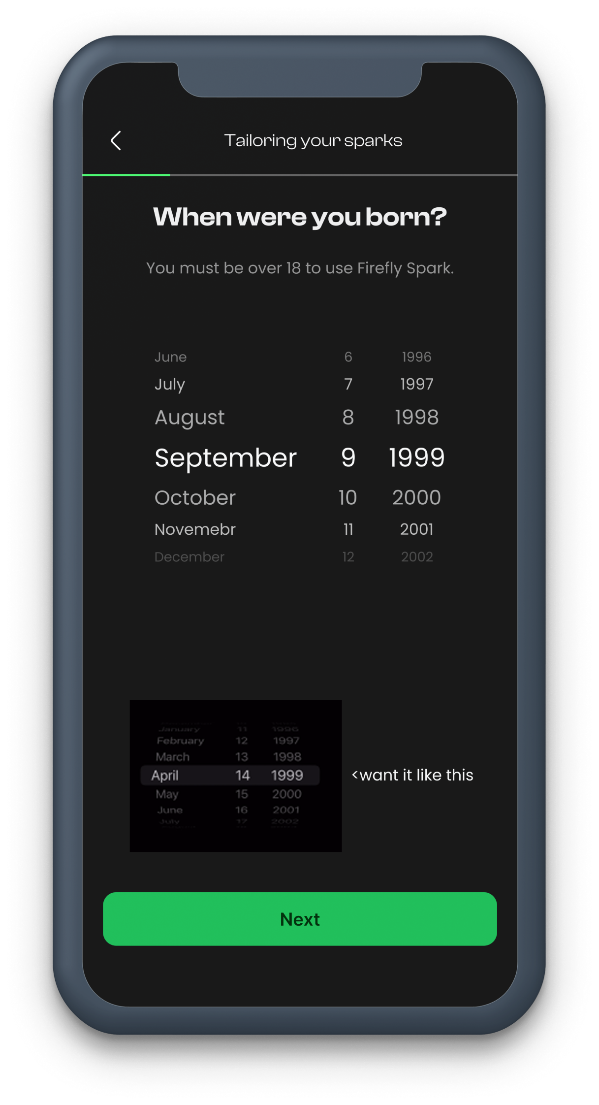
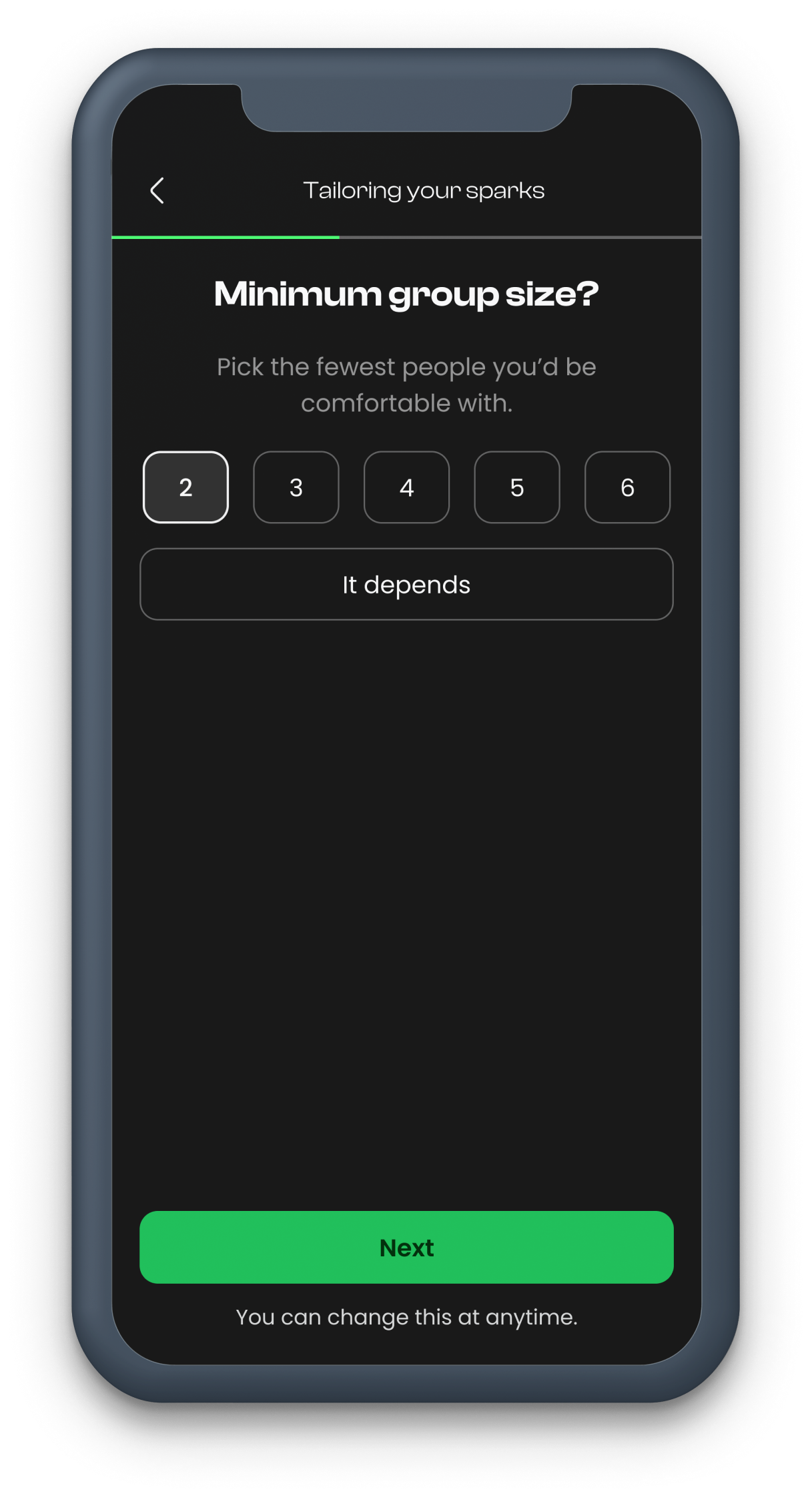
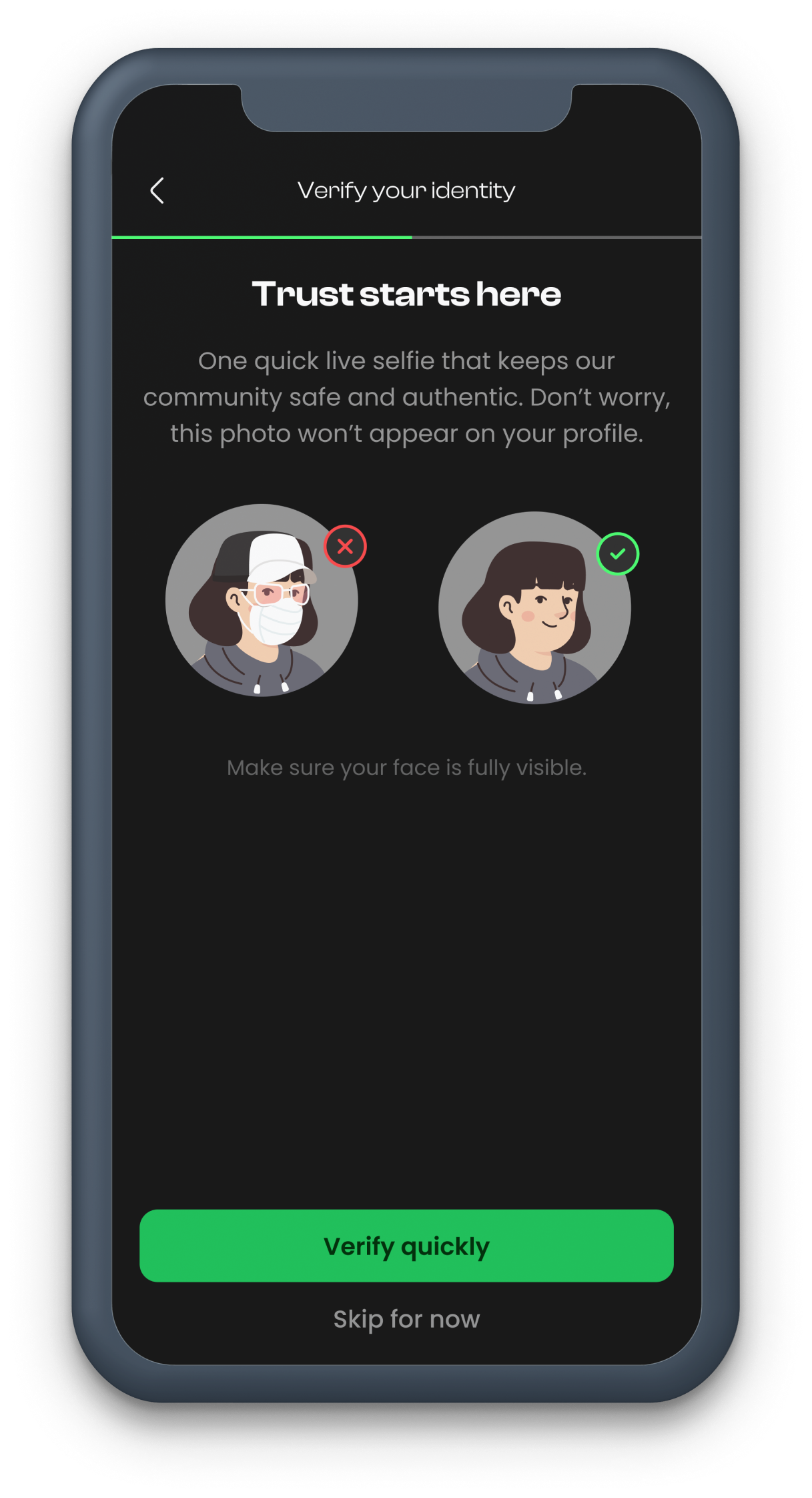
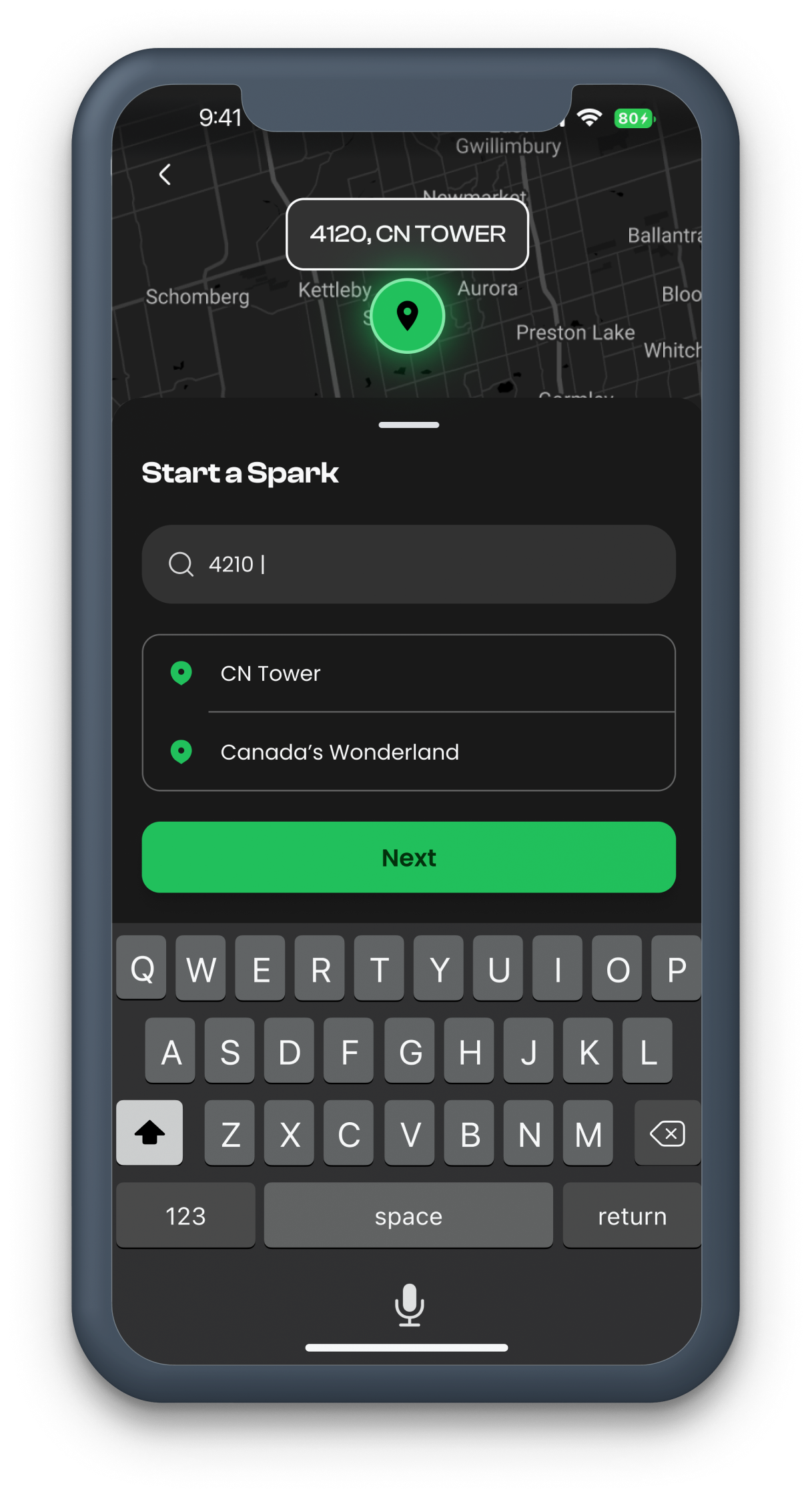
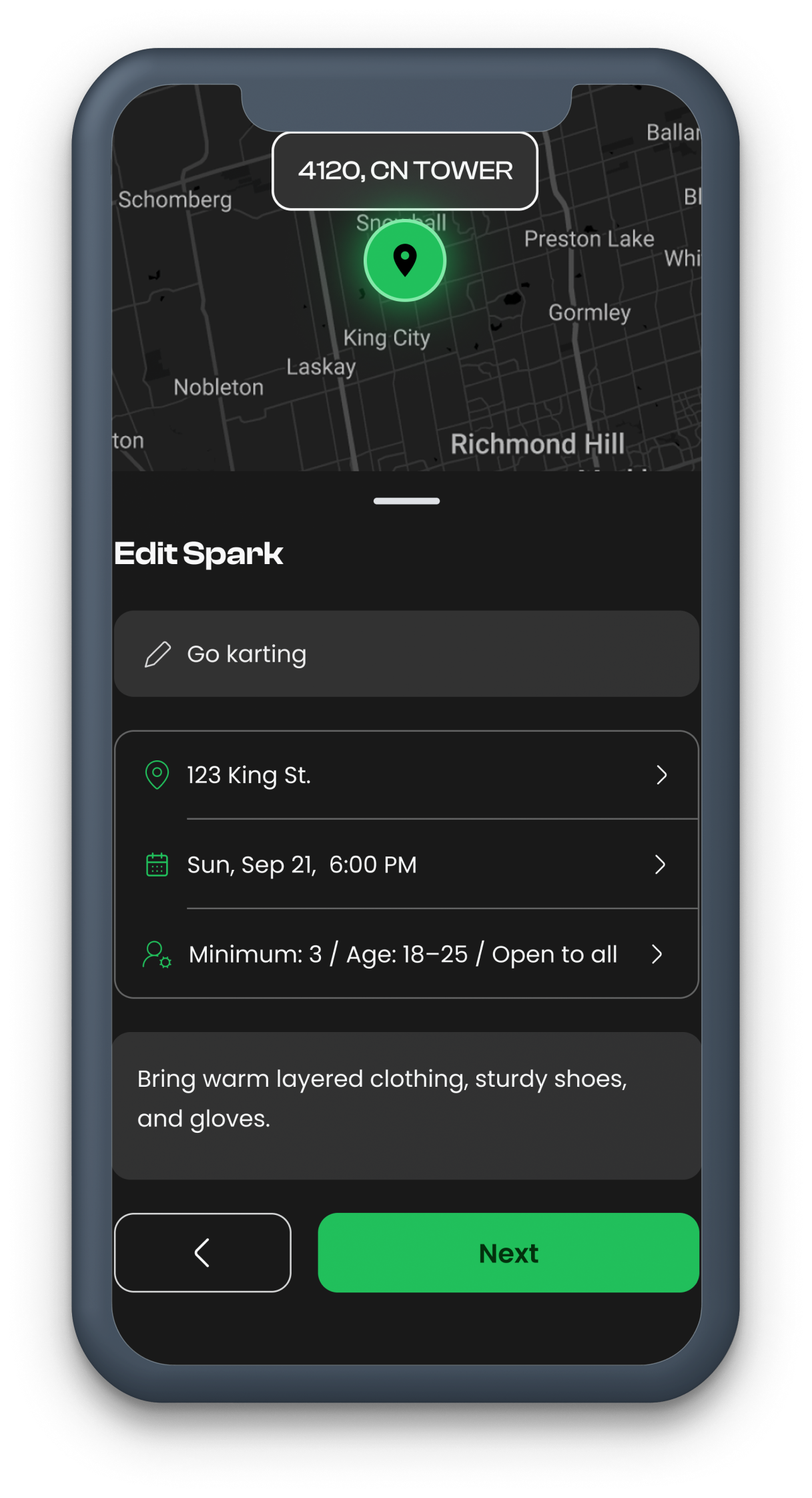
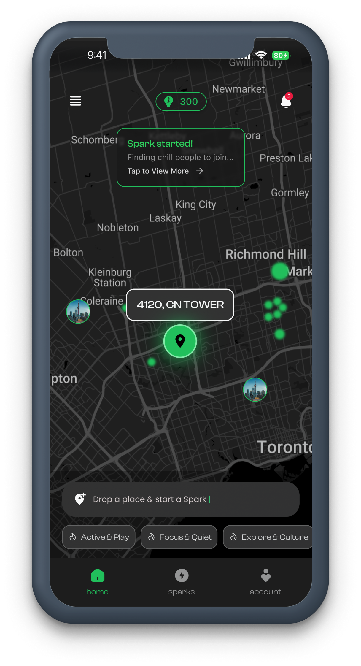
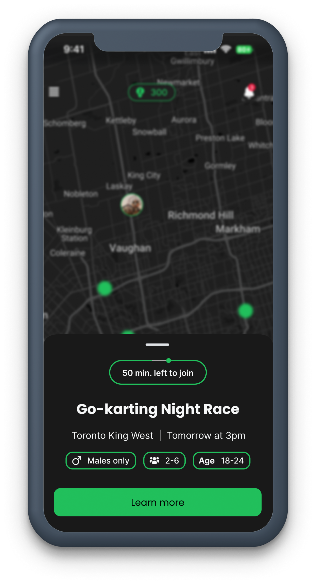
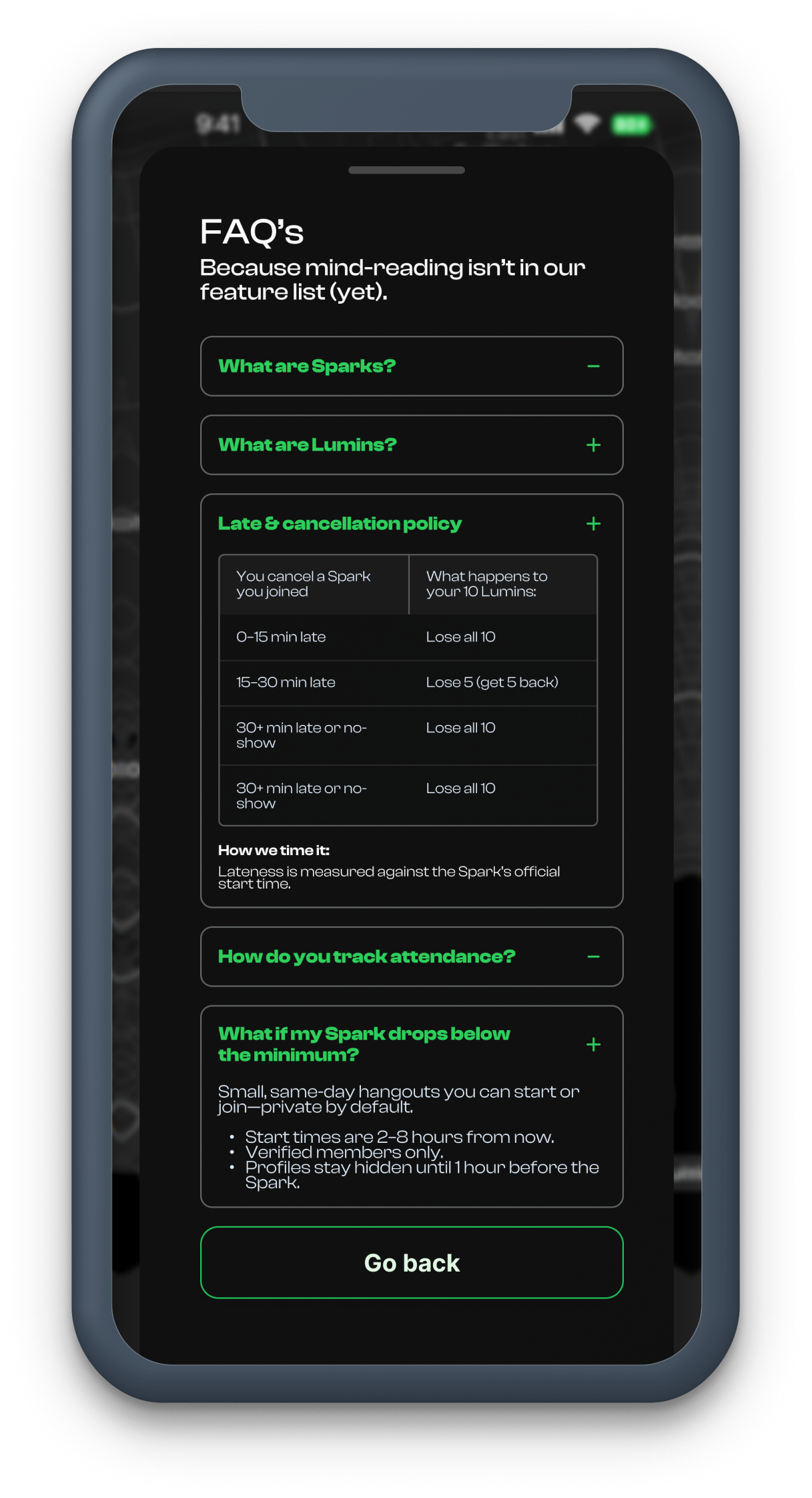
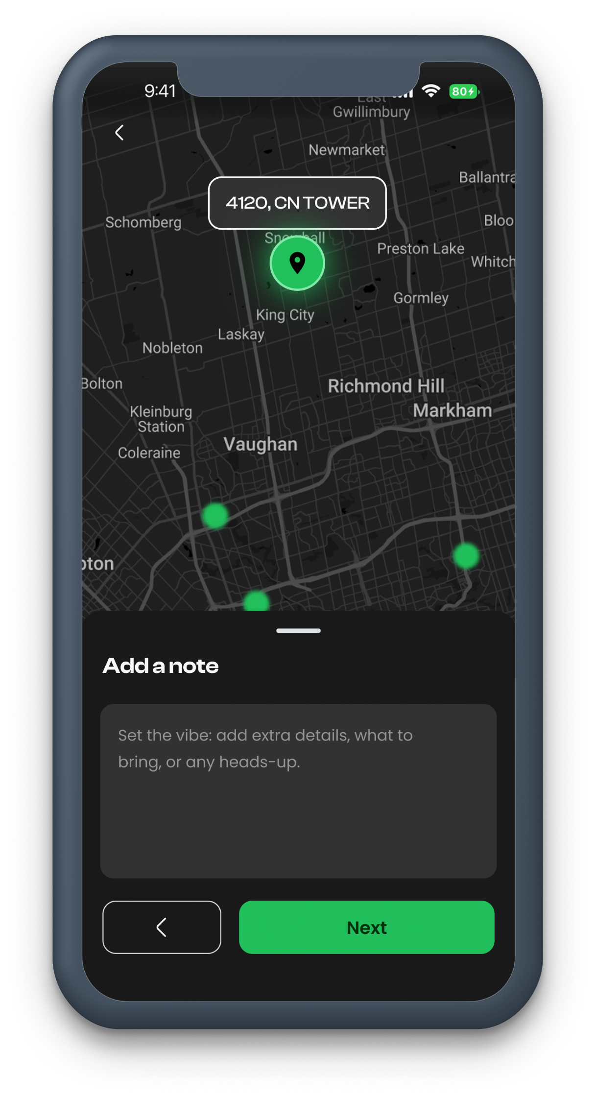
User Flow for Spark Creation
The user flow is consciously kept easy so that the app's users can reach their desired goal without much effort.
Iteration
Firefly Spark V2 Designs
The user flow is consciously kept easy so that the app's users can reach their desired goal without much effort.
Why We Transitioned from V2 to V3 Designs
- We wanted Firefly Spark to feel like a premium product but with a light, fresh theme — something the V2 designs did not fully achieve.
- V2 relied heavily on scrollable pages and a Spark creation flow that resembled filling out a form, which discouraged passive users from hosting activities.
- Without hosts creating events, others couldn't join or go out — so we needed to make the app highly action-oriented.
- The V2 homepage gave off "browse and scroll" vibes, encouraging users to endlessly search for events or switch to other apps if they didn't find something quickly.
- Our mission was the opposite: to get users out and being spontaneous, not stuck scrolling.
- We wanted Firefly Spark to feel cool, fun, and effortless — inspiring users to jump in and spark hangouts instantly.
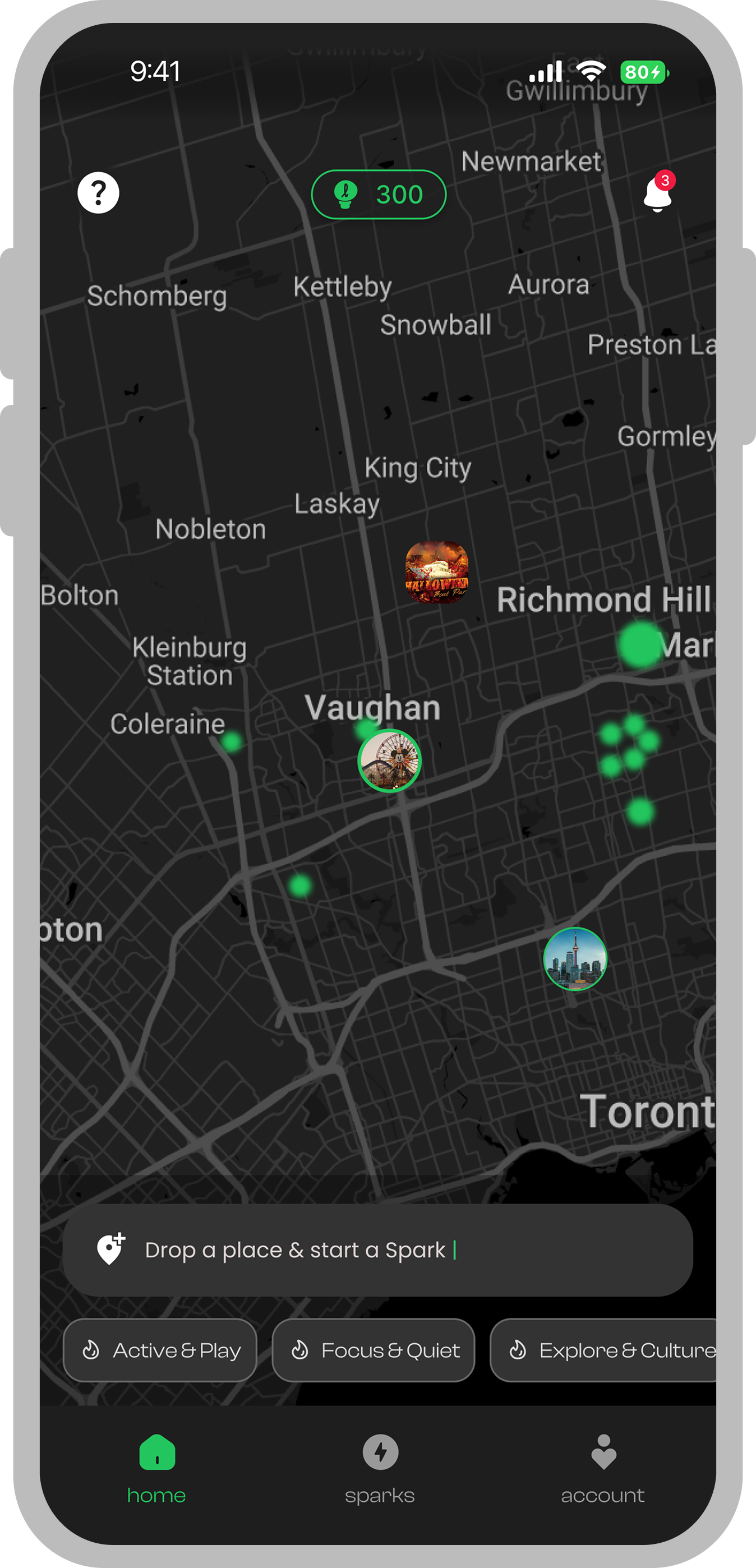
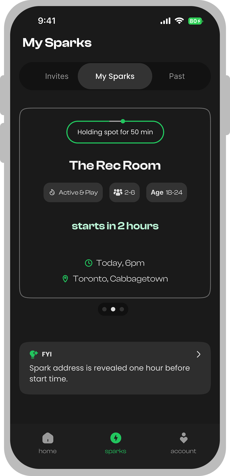
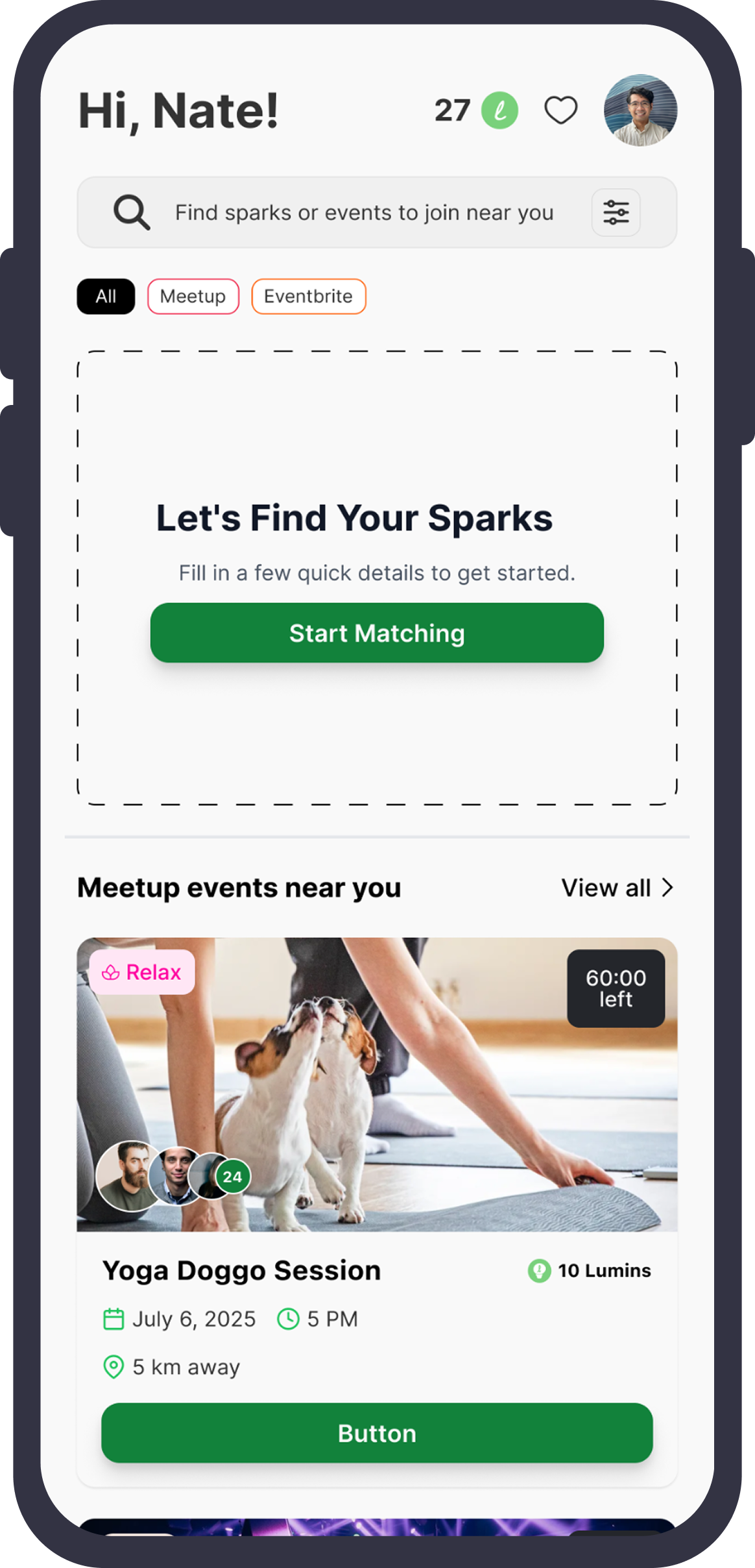
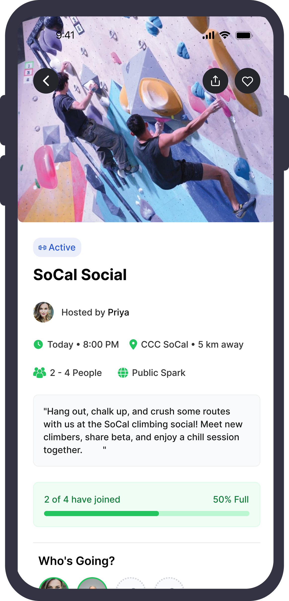
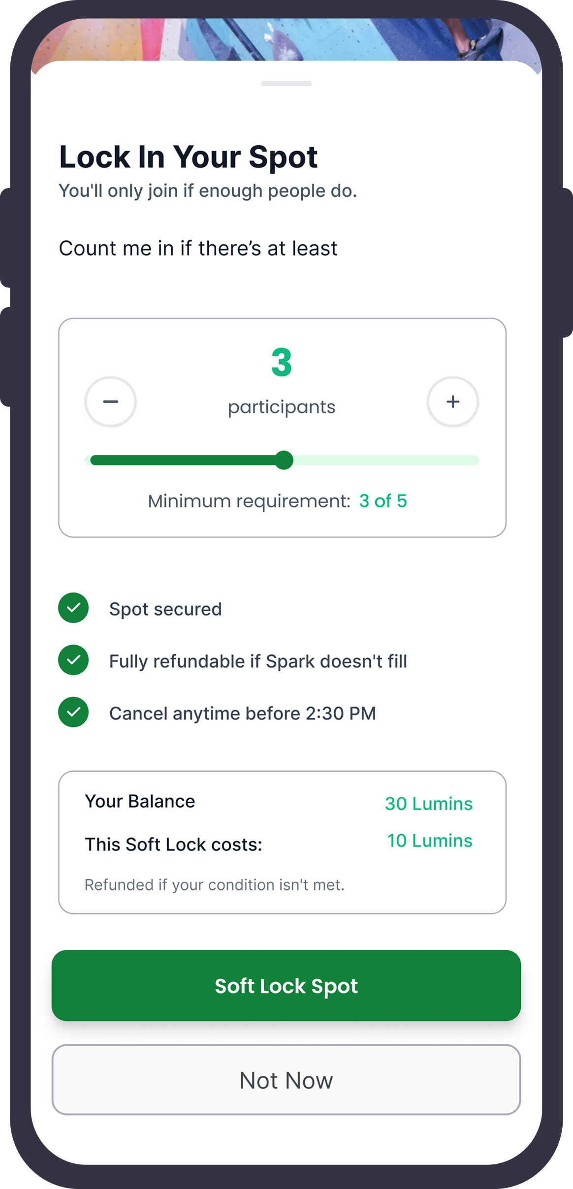
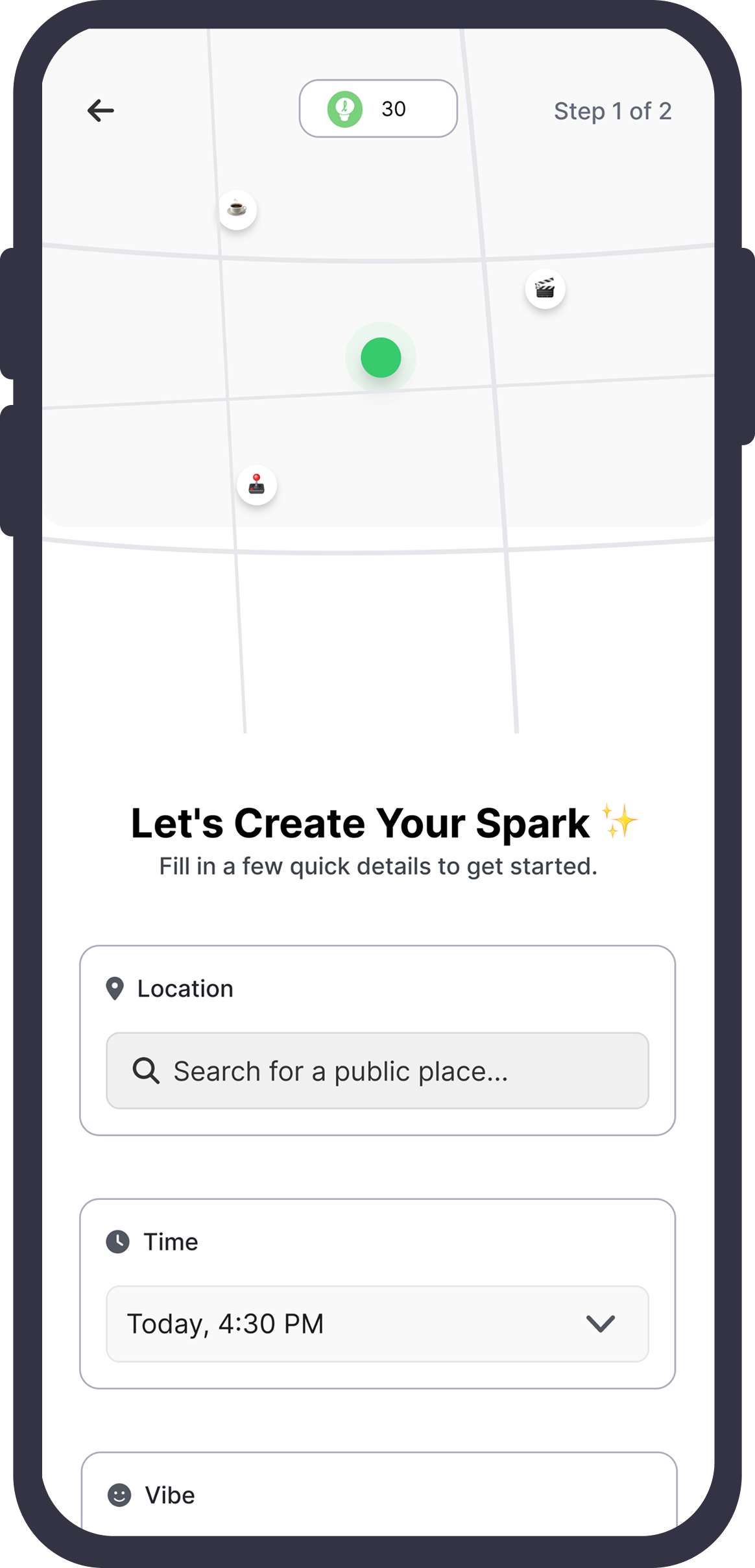
Final Design
Firefly Spark V3 Designs
The user flow is consciously kept easy hence that the apps users can reach their desired to put it on without much effort.
Showcase
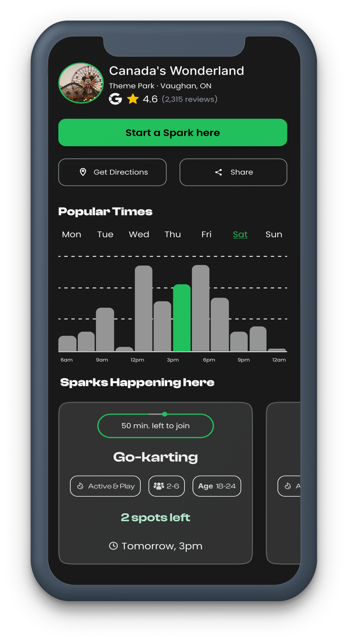
UI Design
A mosaic of the final app screens — showcasing the complete visual language and interaction patterns across every key user flow.
Reflection
Insights & Takeaways
- 01Building a seamless and intuitive UX is key to encouraging social connection, especially for introverts and passive users.
- 02Spontaneity in real-life meetups requires removing barriers like stress, hosting pressure, or complex sign-ups.
- 03Instant suggestions and safety features significantly boost user confidence and engagement.
- 04Simplicity and natural flow in the app experience make it feel approachable and easy to use.
- 05Real-world testing showed users appreciate stress-free ways to break social isolation and build meaningful connections.
These lessons will guide continuous improvements to ensure Firefly Spark truly helps people connect effortlessly in the real world.
Thanksforwatching!
Next Project
Enterprise Operations Dashboard